Design & Configure
The goal was to simplify the design process for kitchen and interior designers using the software, allowing them to drop cabinets and visualize finishes with just a few clicks—without needing to fully understand the catalog and configuration settings of our supplier.
Contribution
Head of Product
Team Leader / Product Management
Principal UI/UX Designer
Problem
The Form supplier’s catalog is a double-edged sword. On one hand, it offers thousands of cabinets and configurations, giving professional designers the flexibility to create almost custom kitchens. On the other hand, it demands extensive knowledge of the catalog and its configurations, making it difficult for designers without that expertise to work efficiently.
Although we can reduce the catalog elements, we can’t change or reduce the amount of configurations needed, since they are important for the factory to produce the cabinetry.
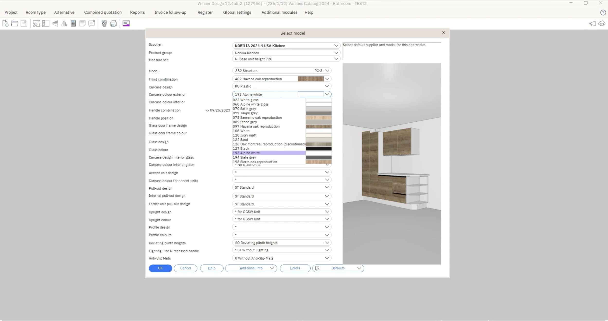
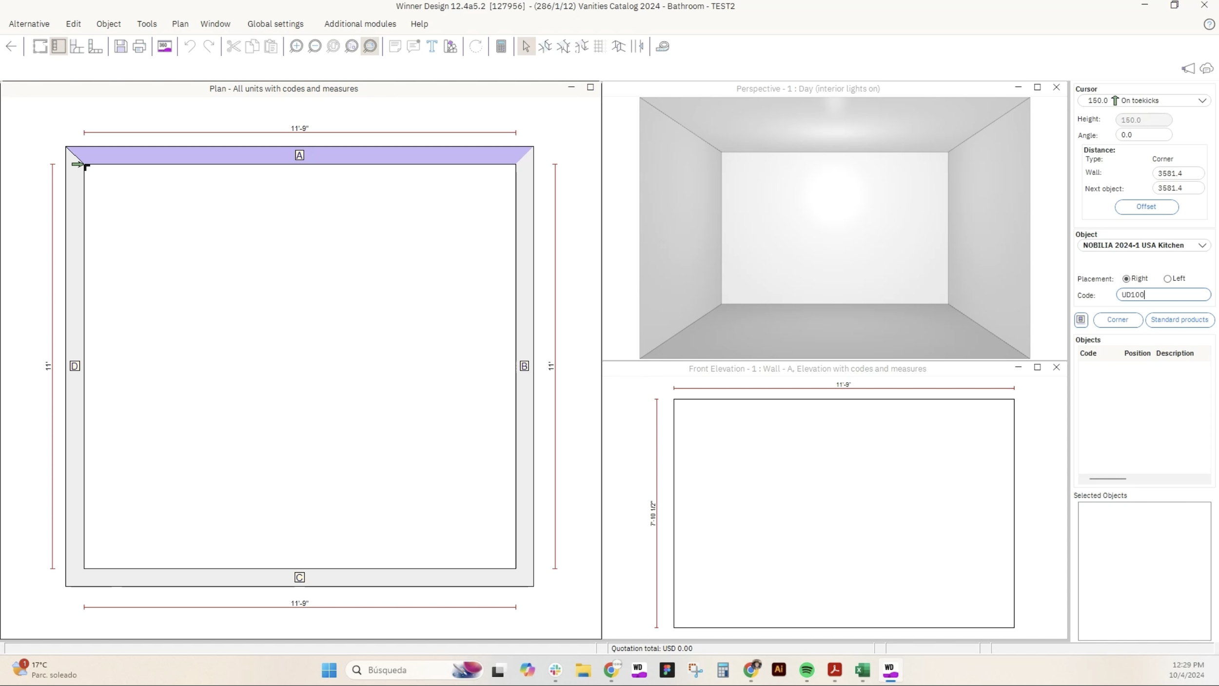
The tool out technical team currently uses is called Winner. The configuration settings interface of Winner is built within a modal, making the selection process less visual and heavily dependent on the user's knowledge of the catalog and its codes.
Winner also only allows one default configuration per file, which creates confusion during order confirmation. Most designs include multiple cabinet configurations and any deviations from the default trigger warnings. This makes the supplier order confirmation process slow and inefficient.
Quote from the technical team
“I have to set all the configurations before I can start designing, for all types of cabinets, even for the ones I’m not using. This takes plenty of time and knowledge.”
Technical Solution
Even though all configurations needed to exist, we could streamline the process by separating them into sections:
Mandatory Configurations: These are required for most designs and cabinets, prompting users to set them by default.
Special Configurations: These are only prompted when necessary, appearing when a cabinet that requires them is added.
Set Defaults: For more complex configurations, we defined defaults that could be easily adjusted by users with the necessary knowledge.
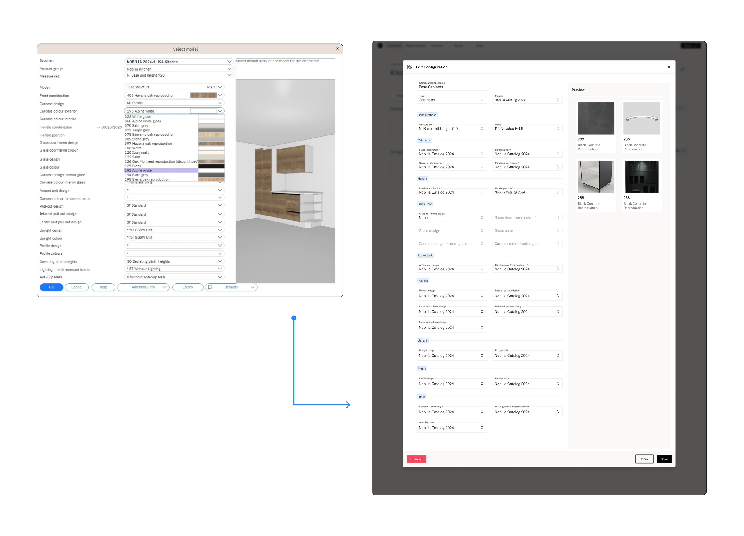
Due to time and technical constraints, we couldn’t display real-time previews of how the configurations would look. However, I proposed using images and illustrations to help customers understand their selections without overwhelming them.
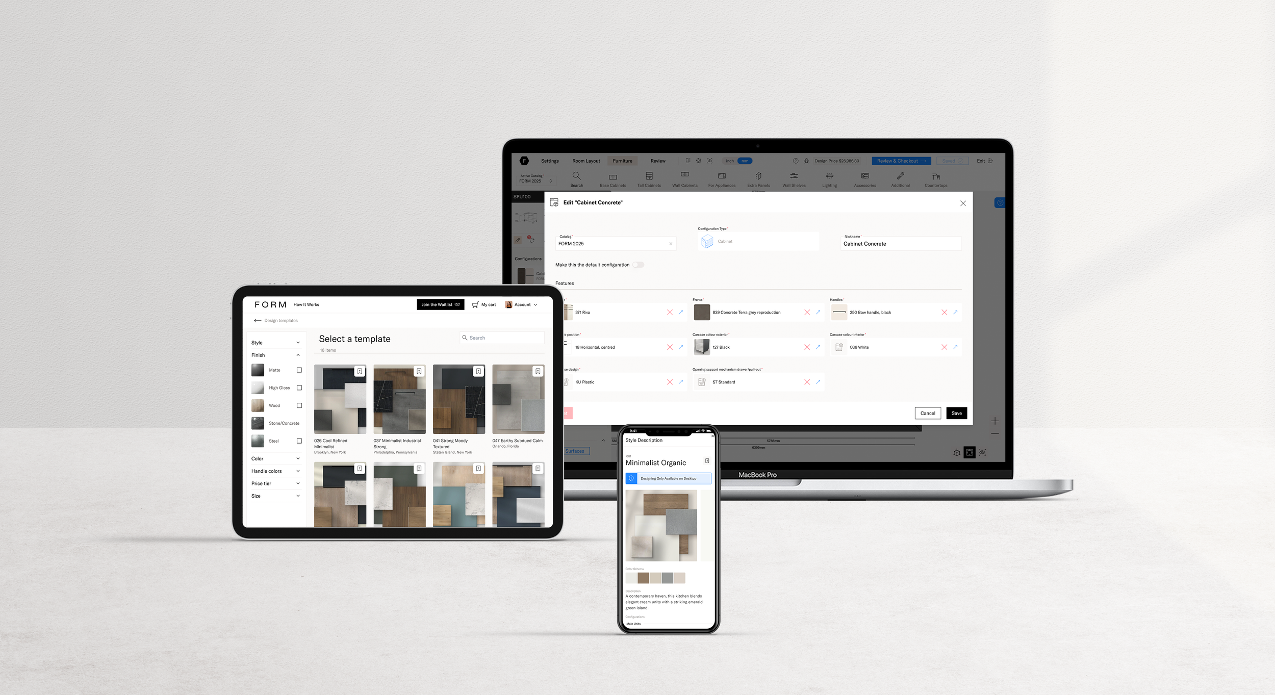
Since our customers are designers who naturally gravitate towards visual solutions over text-based ones, I knew it was essential to make the editing and selection process as visual as possible.
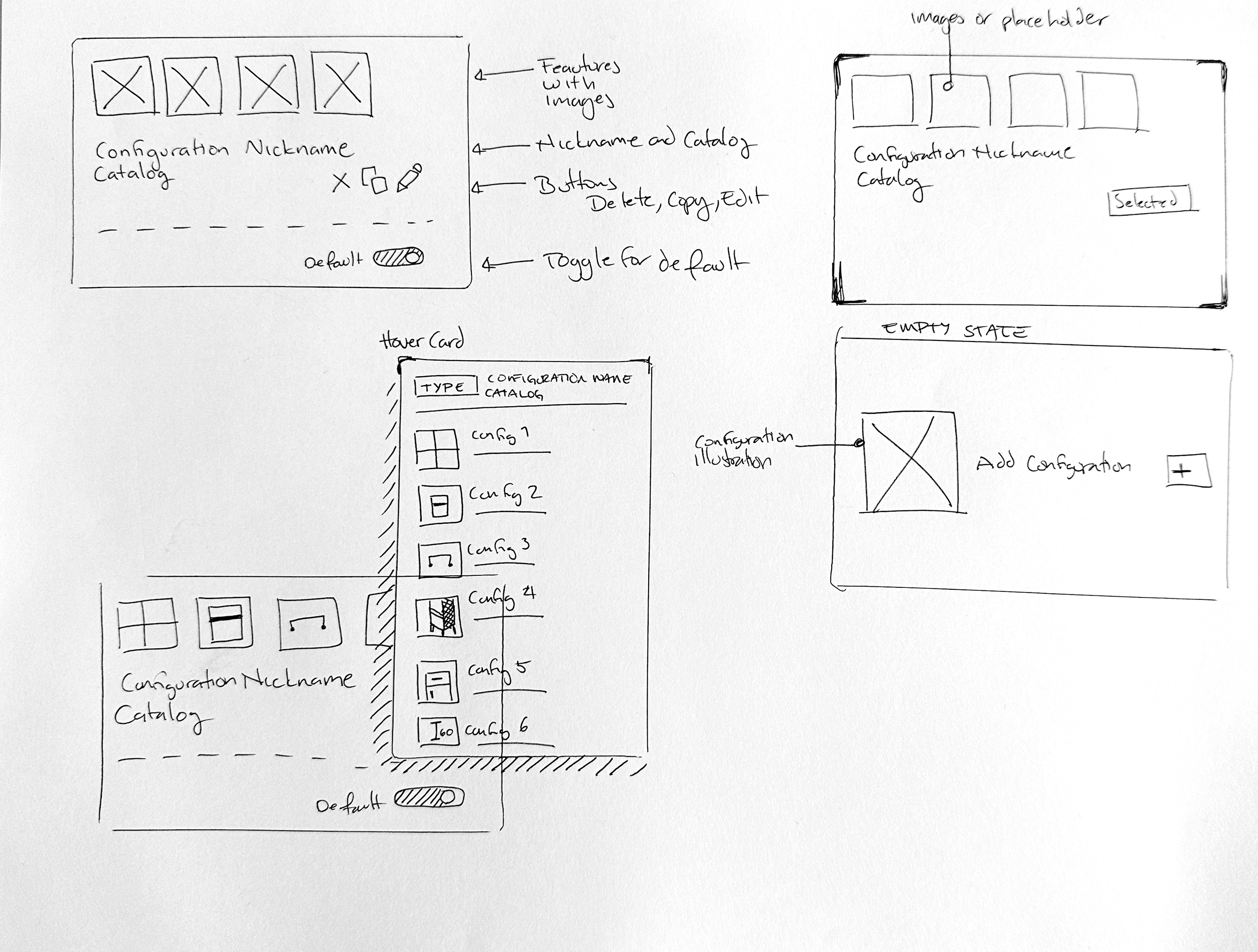
First version of configuration modal didn’t have the separations, it was a similar design as the in Winner.
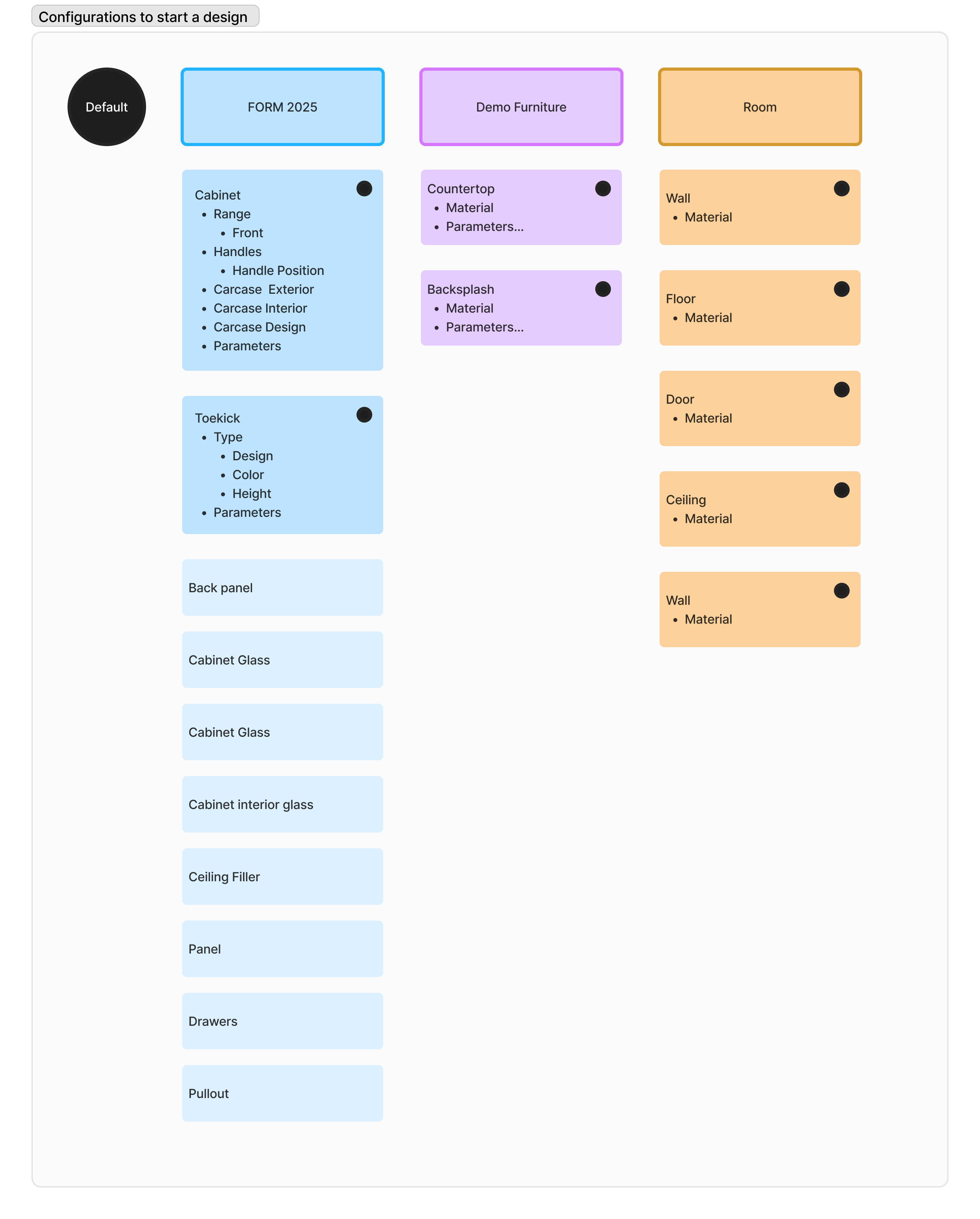
We mapped out how to separate the configurations, determining which ones must be defined by default and ensuring scalability with other catalogs.
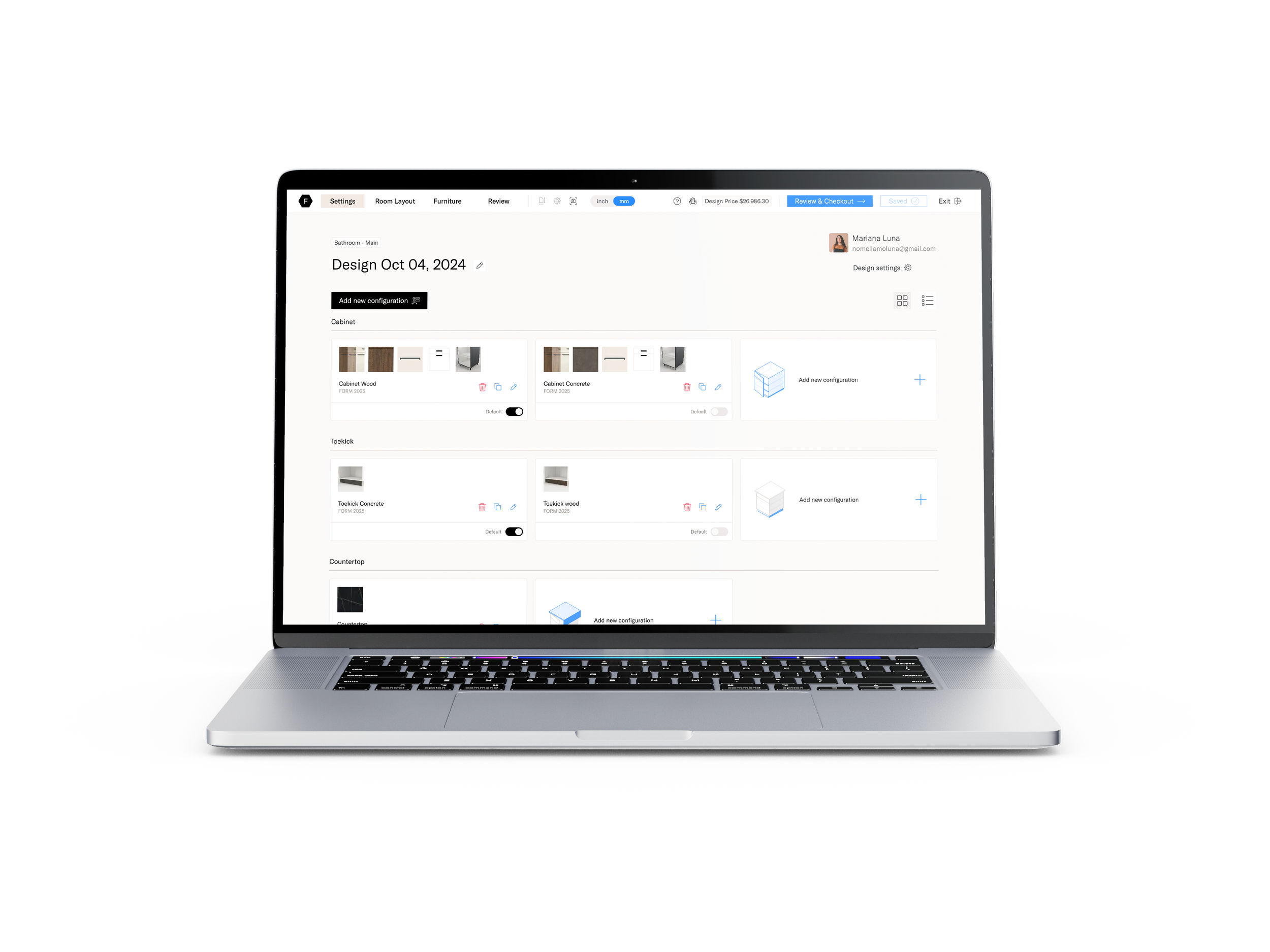
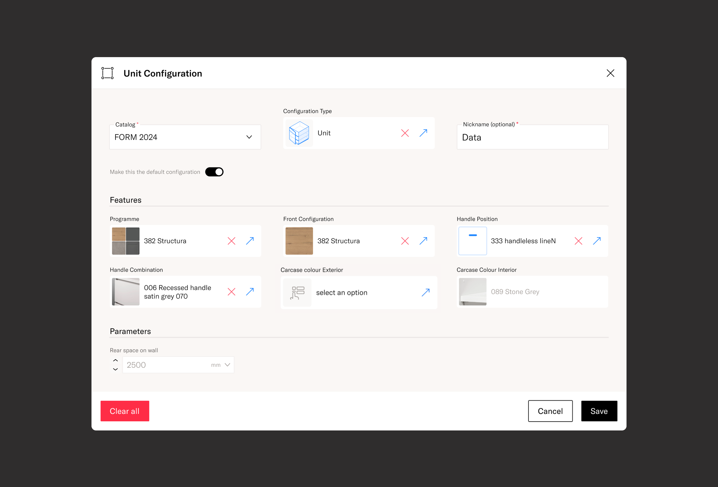
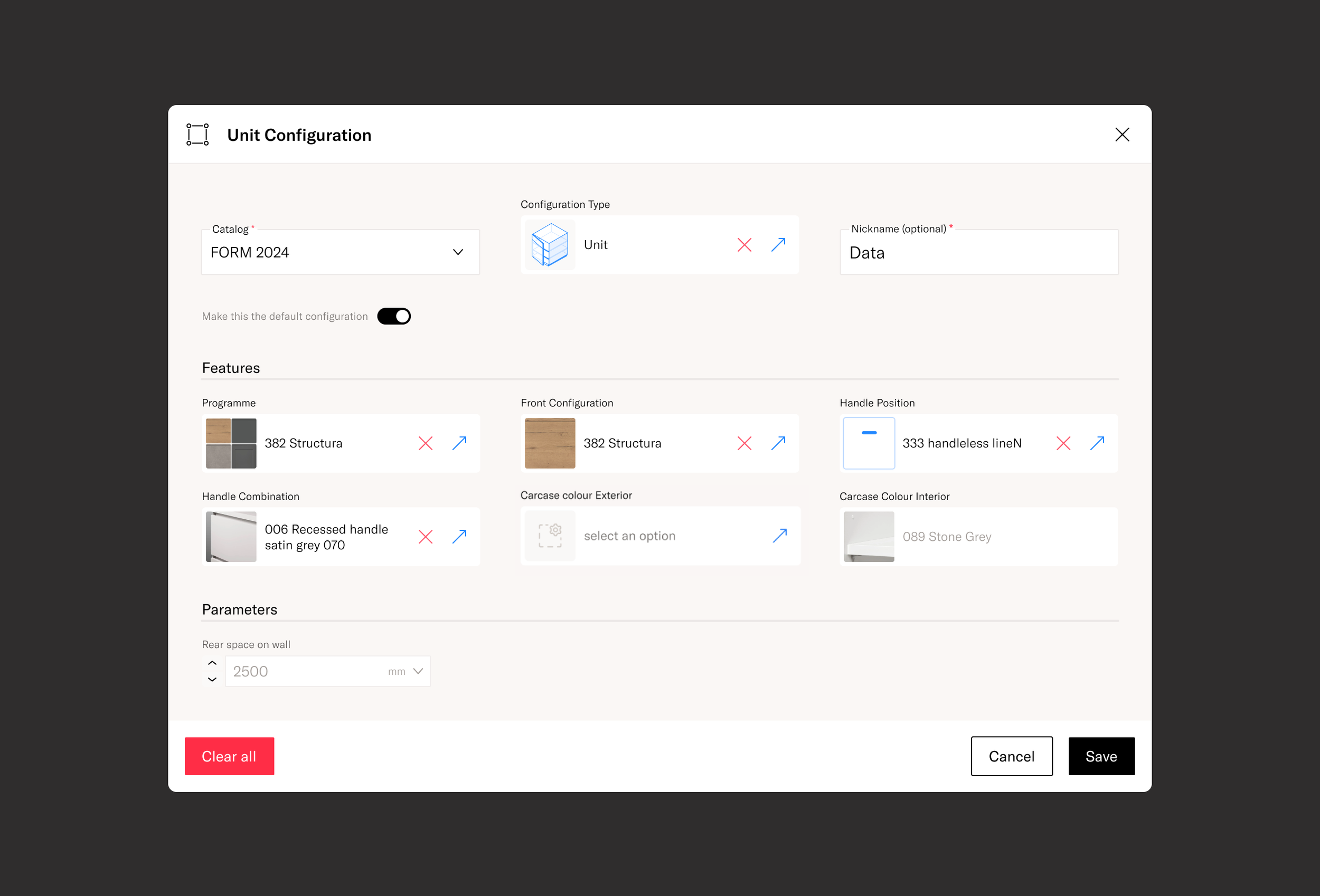
Configuration components
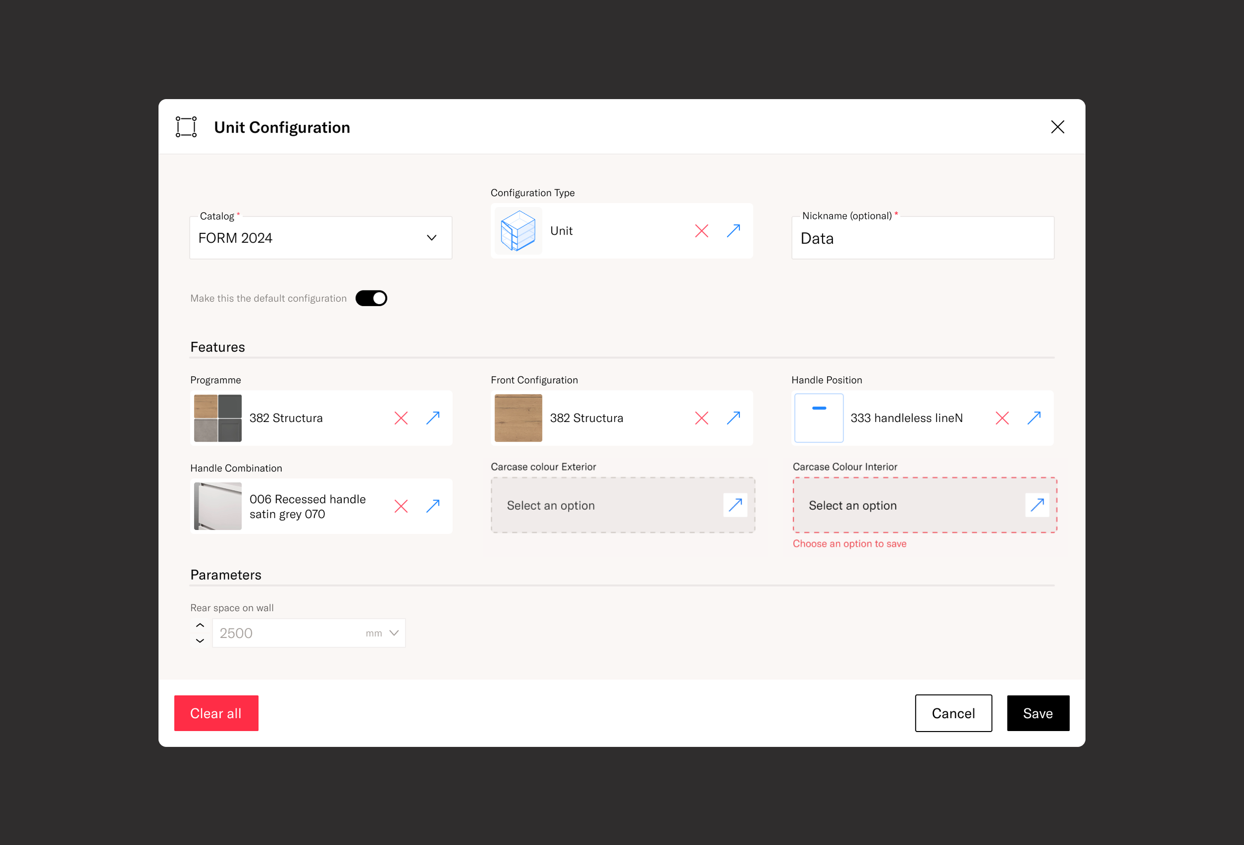
Since we needed a more visual approach, we designed an intuitive experience that allowed users to easily select, change, replace, copy, and edit configurations.
This was an enjoyable challenge. We used the supplier's images at the largest possible size to enhance clarity. For configurations without images, a visual designer created custom illustrations.
We collaborated closely with the technical team to ensure these illustrations were displayed effectively, providing a seamless user experience despite the lack of real images from the supplier.
I structured the Configuration component with scalability in mind, ensuring it would work for all configurations, even without images.
I proposed giving configurations nicknames, allowing users to quickly identify and edit them when needed. This also helped the technical team manage order confirmations more efficiently.
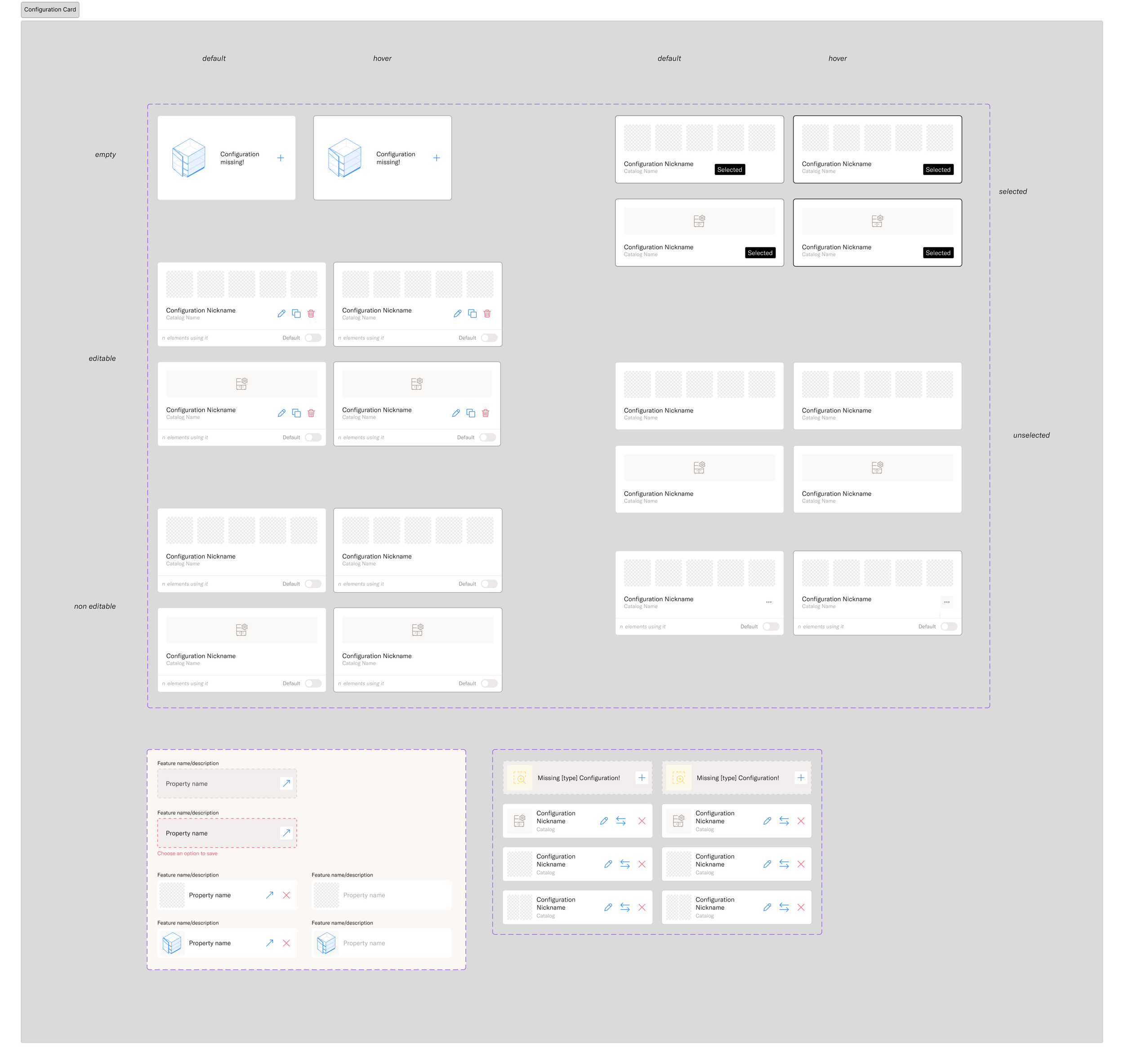
Final component set of the configuration card
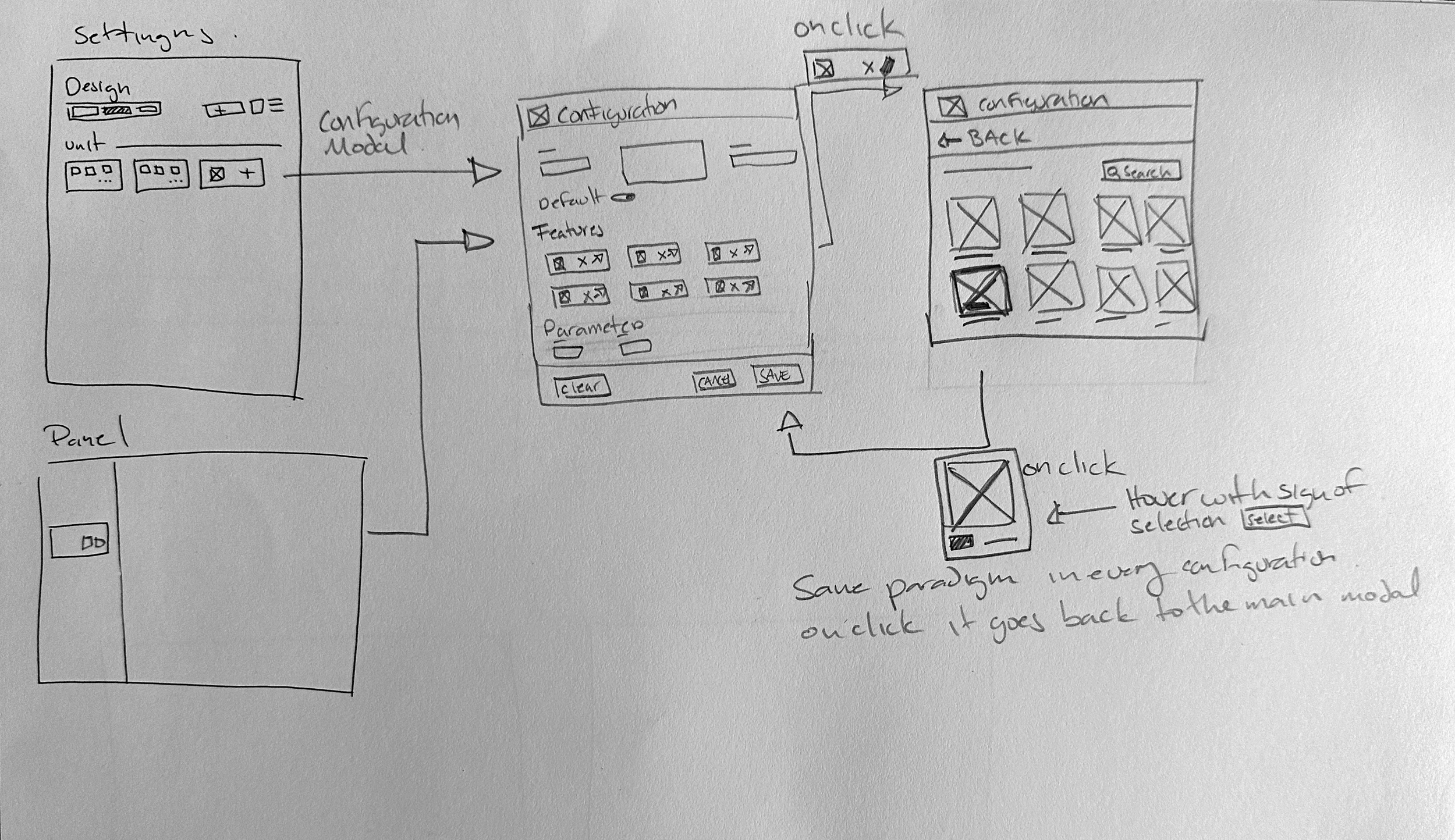
Together with the engineering team, we defined the behavior of the configuration modal, ensuring consistency across all configuration types, so users could edit them using the same paradigm.
I made a quick sketch of the interaction we had in mind and requested a simple Figma prototype that we used to test with the technical design team to make sure the interaction made sense.
Workflows
In parallel on the components interactions we worked on the flows for the configurations. Defined how they will work from the settings panel, the side panel and we agreed on creating a the quick access “sheet” to adjust configuration whilst designing. The goal was to make the card and interaction paradign work always.
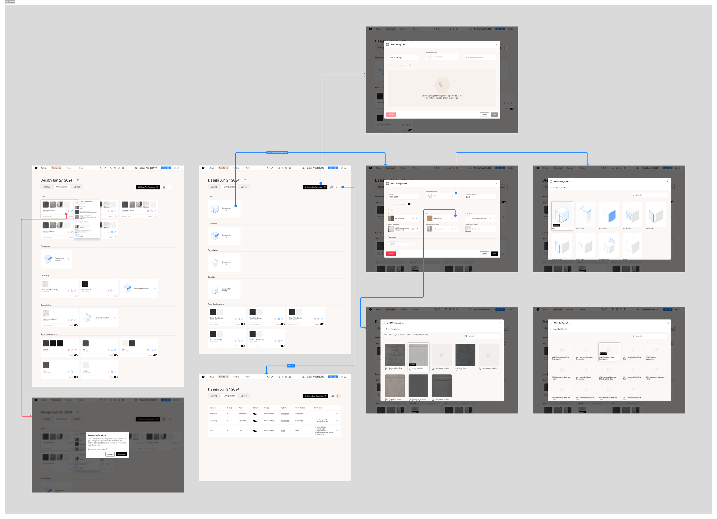
Create, edit, delete configurations from the settings panel on a design.
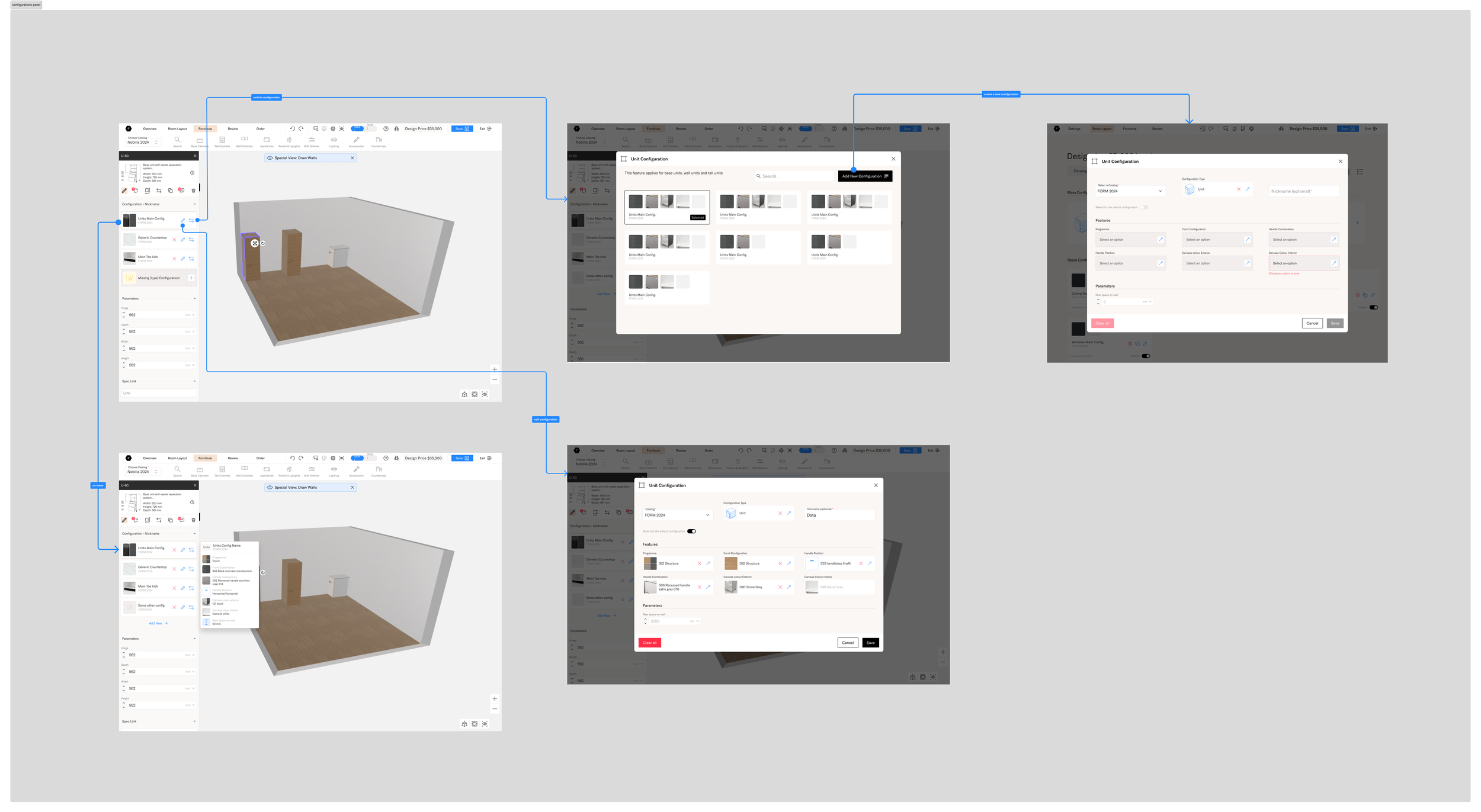
Edit, replace and create new configurations from the left panel on the planner.
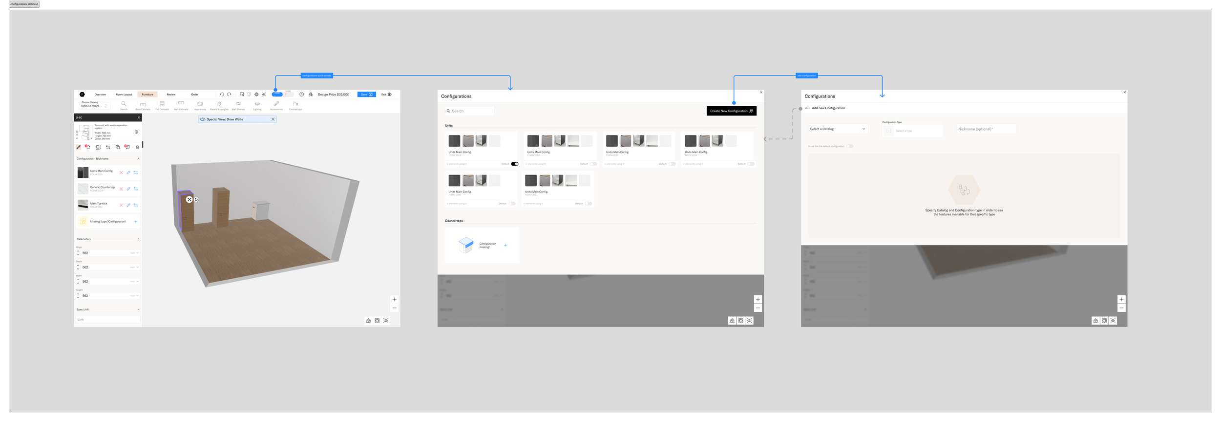
Edit, create fromt the configuration’s shortcut in the header
Interaction in the planner
We established that when a design is created, most configurations would be set by default, including an editable default for mandatory ones.
This made it easier for users to drop cabinets into the scene and adjust configurations as needed. If a cabinet required specialized configurations, the system would prompt the user to set them at that moment, rather than beforehand.
By using configuration nicknames, users could easily identify, edit, or swap multiple cabinets across different configurations at once. For technical designers, this simplified the workflow, allowing them to rely on the actual item list configurations instead of error-prone warnings to determine which configurations applied to each cabinet.
Results
Quote from the technical team
“I’m used to the configurations modal, but I think people will prefer something like this, but it’s still difficult to configure everything from scratch.”
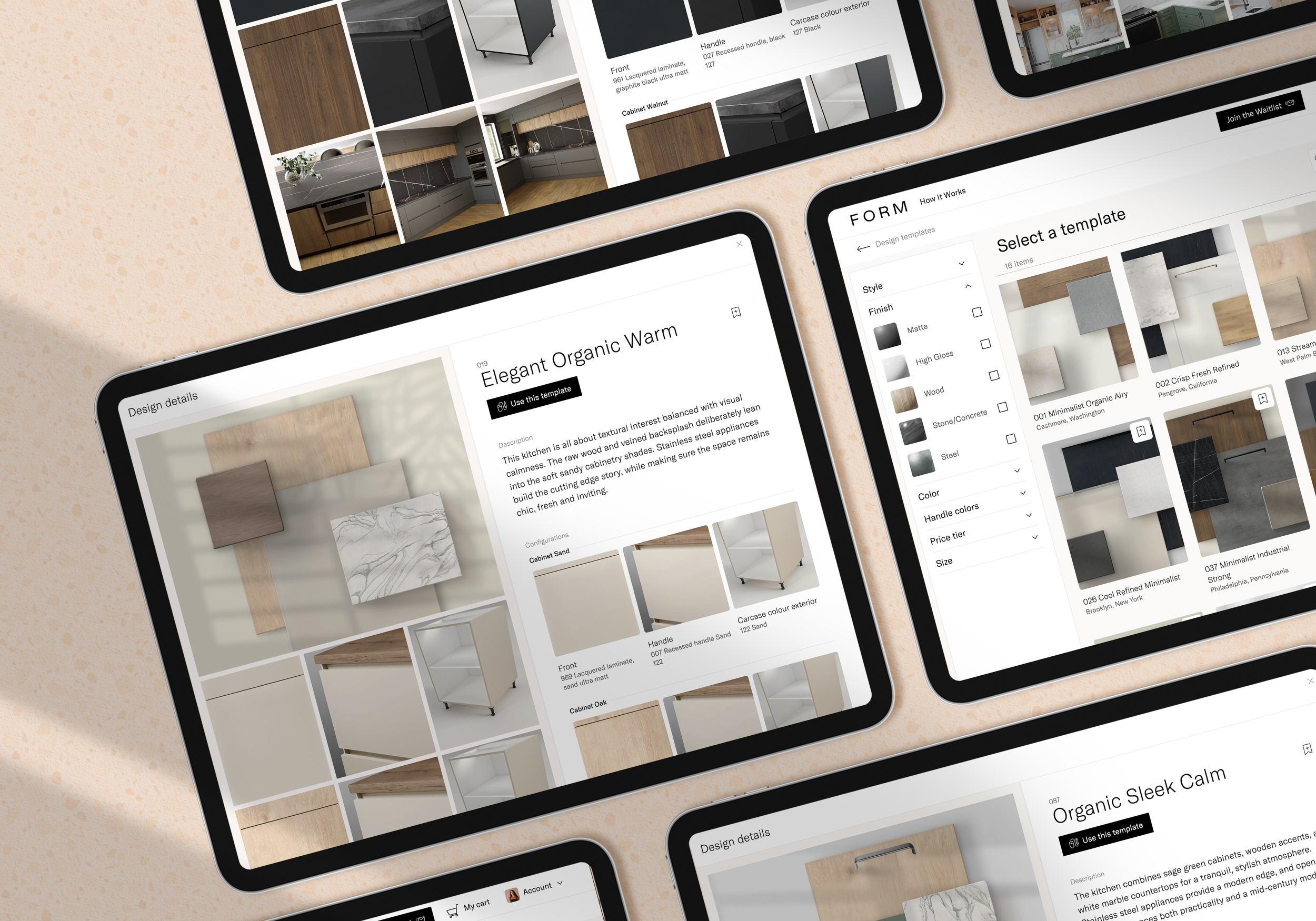
Design Templates
Jumpstart the design process
From the feedback we received, I realized that while we had successfully created a configuration system that was more visual and less complex than Winner’s, the supplier’s extensive range of fronts and handles still made it challenging for users without catalog knowledge to choose configurations.
I wanted users to be able to start a design with just a few clicks, without spending too much time adjusting configurations. That’s when I thought of introducing Templates.
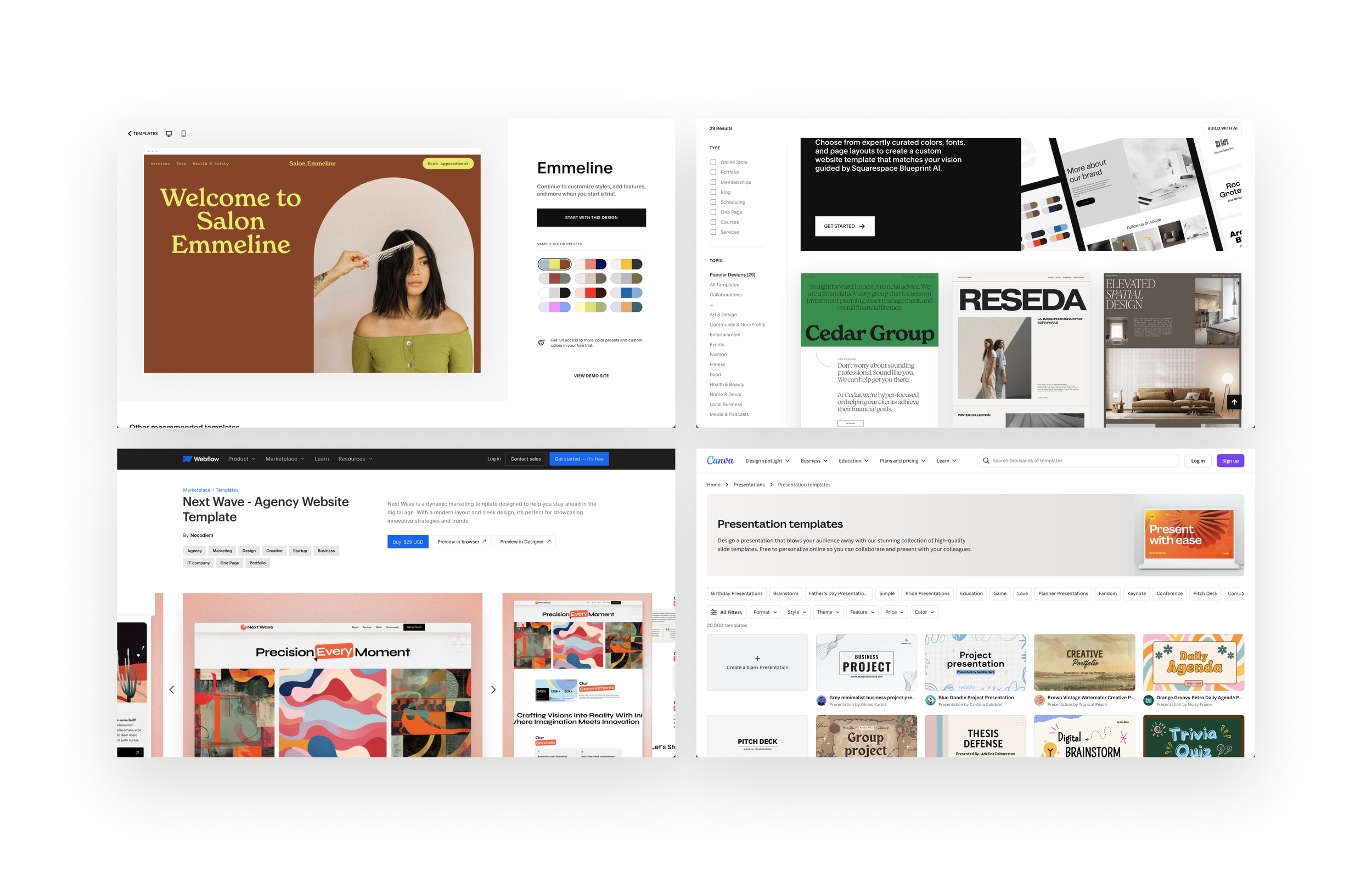
Inspired by platforms like Canva, Webflow and Squarespace, which let users easily browse catalogs, pick a template, and then customize it to their needs, I felt that providing a similar experience would allow designers to jump into the design process quickly.
This would also enable them to share templates with their customers, letting clients choose a starting point—ultimately helping designers convert faster.
First Idea
Create a catalog showcasing some of the renders previously made for FORM Kitchens, featuring kitchens that can be designed using the supplier's catalog. This would highlight how the finishes look in a new design context.
I also collaborated with the technical team to see if it was possible to generate designs with a defined set of configurations.
Quote from team
“Oh, so if I choose that template those cabinets will appear in the design? Can I move them? But what if the space is different?”
Second Idea
I realized that showcasing full kitchen renders might give the impression that the template included the complete kitchen, already designed, which wasn’t the case—we were simply showcasing finishes. To avoid confusion, the best approach was to focus on the finishes themselves and use the renders only as examples of how they appear in a design, rather than the primary feature of the gallery.
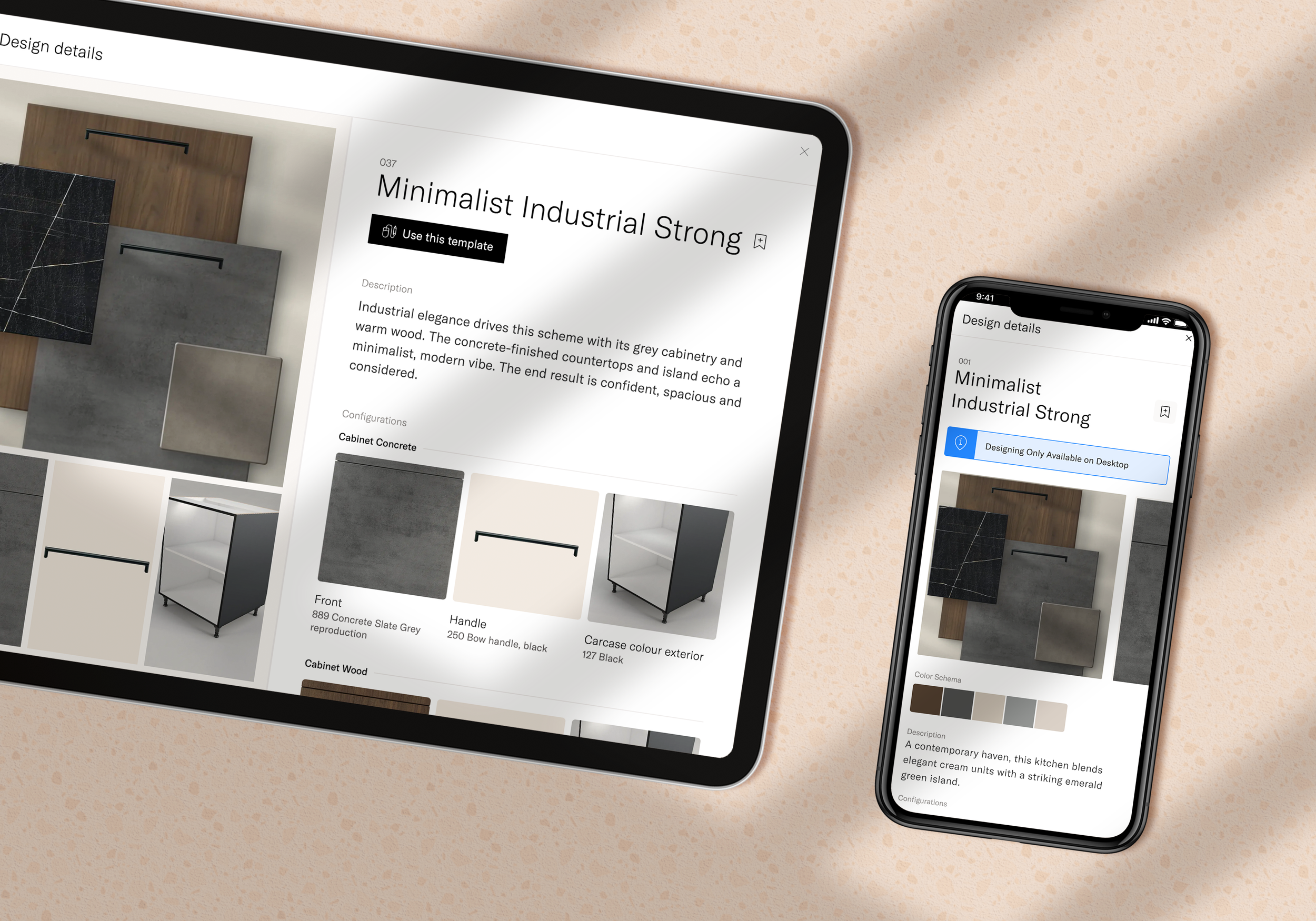
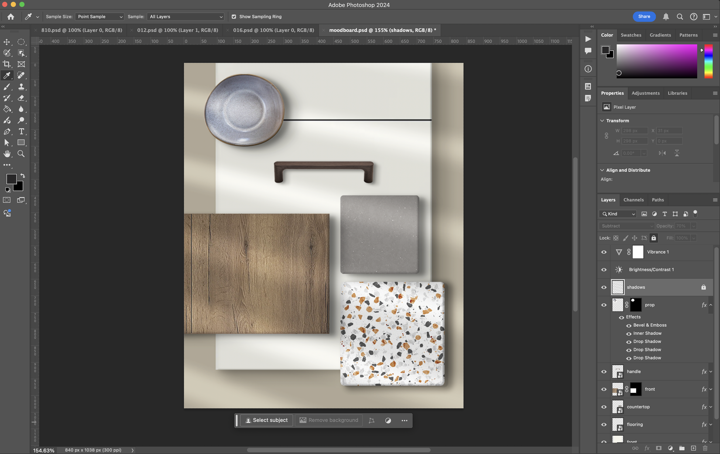
Inspired by how interior designers and architects present moodboards of finishes to clients, I developed a template to showcase finishes similarly. Using Photoshop and the supplier's images, we could create moodboards that speak the same language designers use daily. This approach minimized resource use while effectively highlighting the finishes.
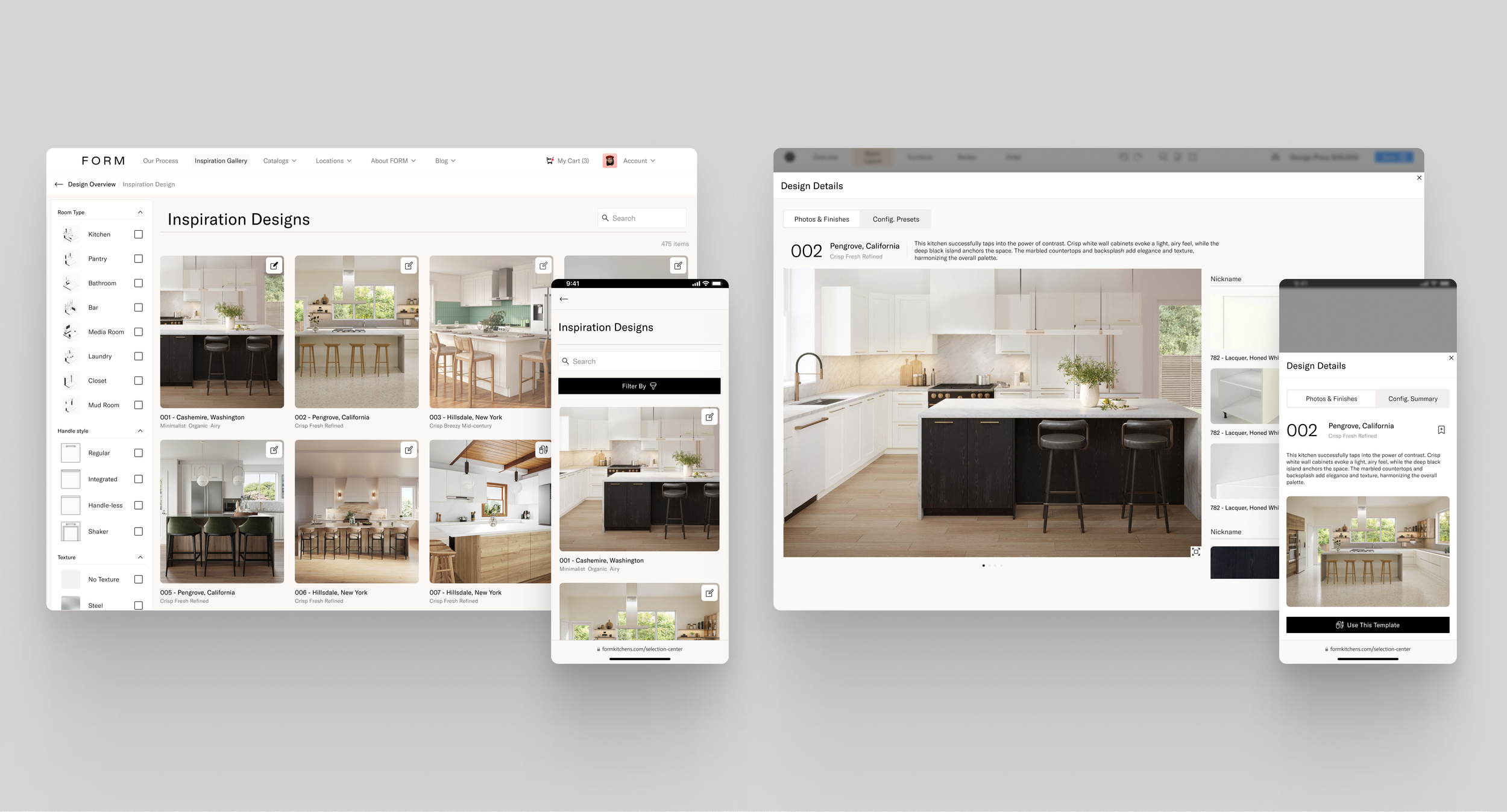
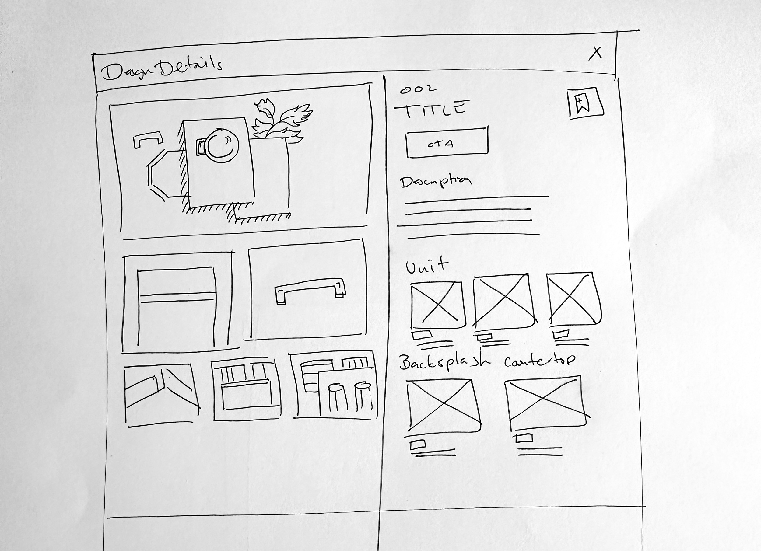
Design templates gallery and details
I defined the template structure with the moodboard as the main image, accompanied by additional visuals to help designers better understand the finishes. I also included an inspirational description to help designers communicate with their clients and a clear display of the finishes, with links to their product pages if available.
To ensure flexibility, I made sure all images for the templates could be sourced from our catalog manager, avoiding any hardcoded elements
A visual designer took on the task of creating all the moodboards, working closely with the technical team to provide the most commonly used finish combinations.
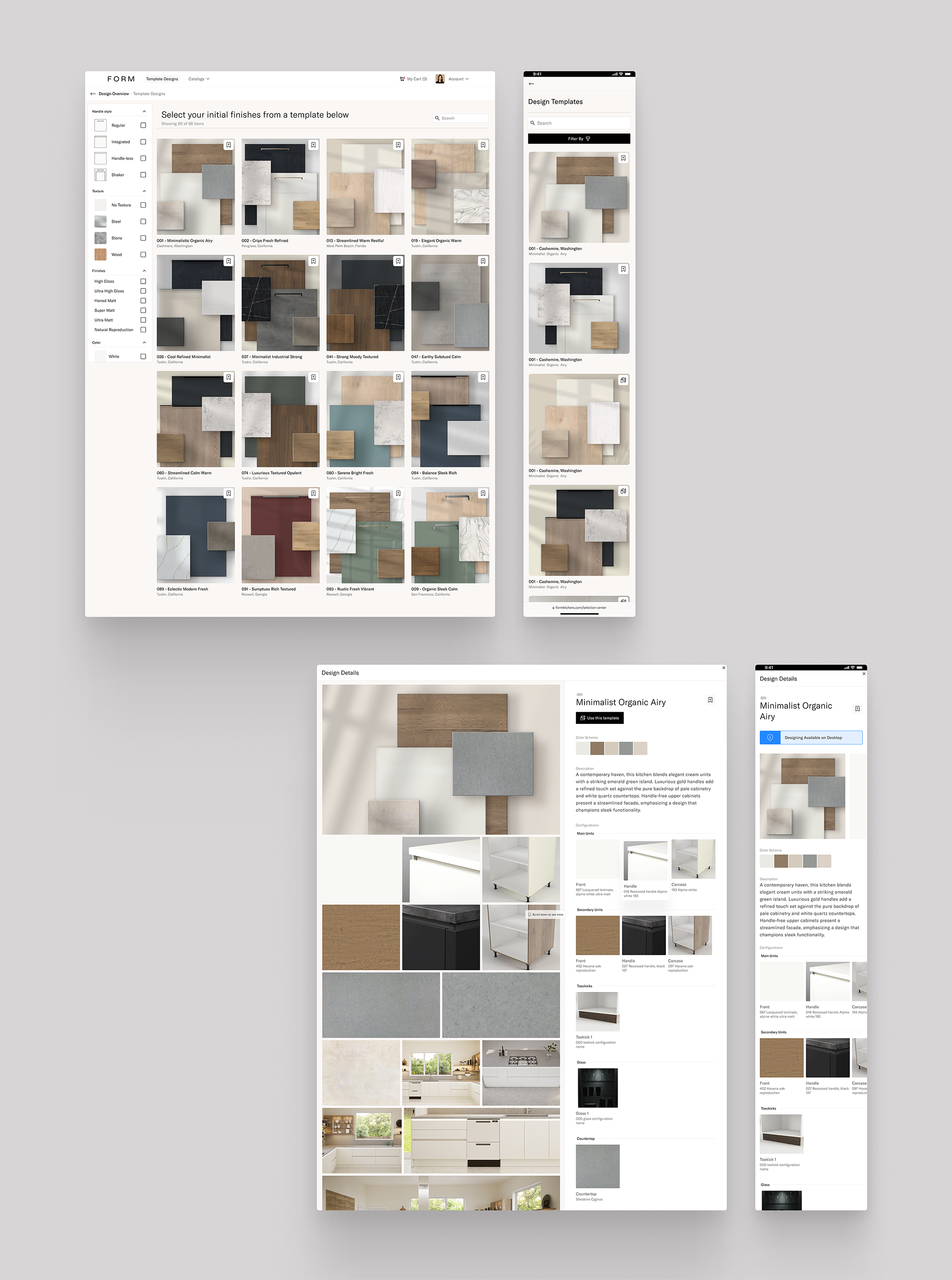
The Result
With the template creation, the customers are able to get inspired by the template finishes gallery and with just a few clicks, start designing with everything configured, allowing the design experience to be centered on design instead of configurations.
Key Learnings
Balance Between Simplicity and Flexibility: Simplifying the design process through templates and configuration defaults allowed designers to focus more on creativity rather than technical details, while still providing flexibility for advanced users.
Visual-First Approach: Catering to designers, who prefer visual solutions, reinforced the importance of making the design process intuitive and visually driven, especially when dealing with complex configurations.
Scalability and Modularity: Ensuring that components, such as the configuration system, were scalable and could work without hardcoded elements was essential for flexibility and future updates.
Collaboration with Technical Teams: Close collaboration with the engineering and technical teams allowed for the seamless integration of design and technical requirements, ensuring a smooth user experience.
Effective Use of Moodboards: Using moodboards as a central design tool helped bridge the gap between inspiration and functionality, providing a visual representation of finishes that both designers and clients could easily understand.
Customer-Centric Design: Designing templates that allowed users to jumpstart the process with pre-configured settings ensured that the experience focused on designing, not on navigating complex configurations.
Thank you!