FORM Design
The goal was to create an all-in-one platform for expert kitchen designers and architects. Allowing quick design creation, detailed estimates, access to technical support, and seamless project management.
This platform also simplifies client collaboration and makes it easy to purchase finalized designs.
Contribution
Head of Product
Team Leader / Product Management
Principal UI/UX Designer
Problem
Independent kitchen designers don’t have access to professional tools that help them grow their business and monetize their work. They’re often stuck using either outdated software or big-box store tools that limit their ability to generate commissions or expand their business. Neither option provides the flexibility or financial support they need.
Quote from business team
“Independent designers are promoting other companies' products without earning commissions or receiving any support, leaving them to manage everything on their own.”
Solution
Create a one-stop platform for independent kitchen designers, backed by a larger company, that offers:
Intuitive online design tools with access to professional catalogs
Instant estimates, 3D views, elevations, and floor plans
Management tools to streamline product ordering, client sharing, and online purchasing
Technical support to ensure accurate ordering and installation
Access to a network of installers to collaborate with
Where to begin?
Define scope
FORM currently has a partnership with a cabinetry dealer, but a key requirement was to ensure the platform's scalability so additional catalogs could be added over time.
We also needed to define all the roles involved, allowing not only independent designers to use the platform but also FORM's internal team of designers.
Another important consideration was the ability to integrate with external tools like HubSpot, Zoho, and Slack to support effective internal project management.
Customer Journey
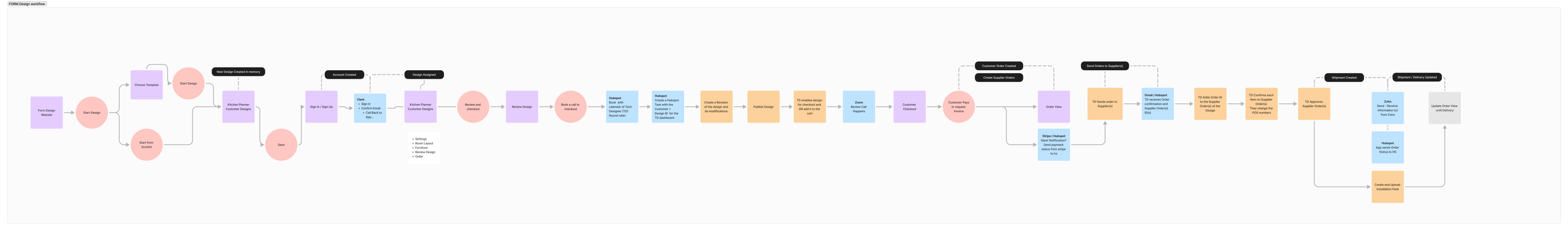
The first step was to map out a simple customer journey. This helped align the product, engineering, and business teams on the key components of the platform and allowed us to define the scope, responsibilities, and tools required.
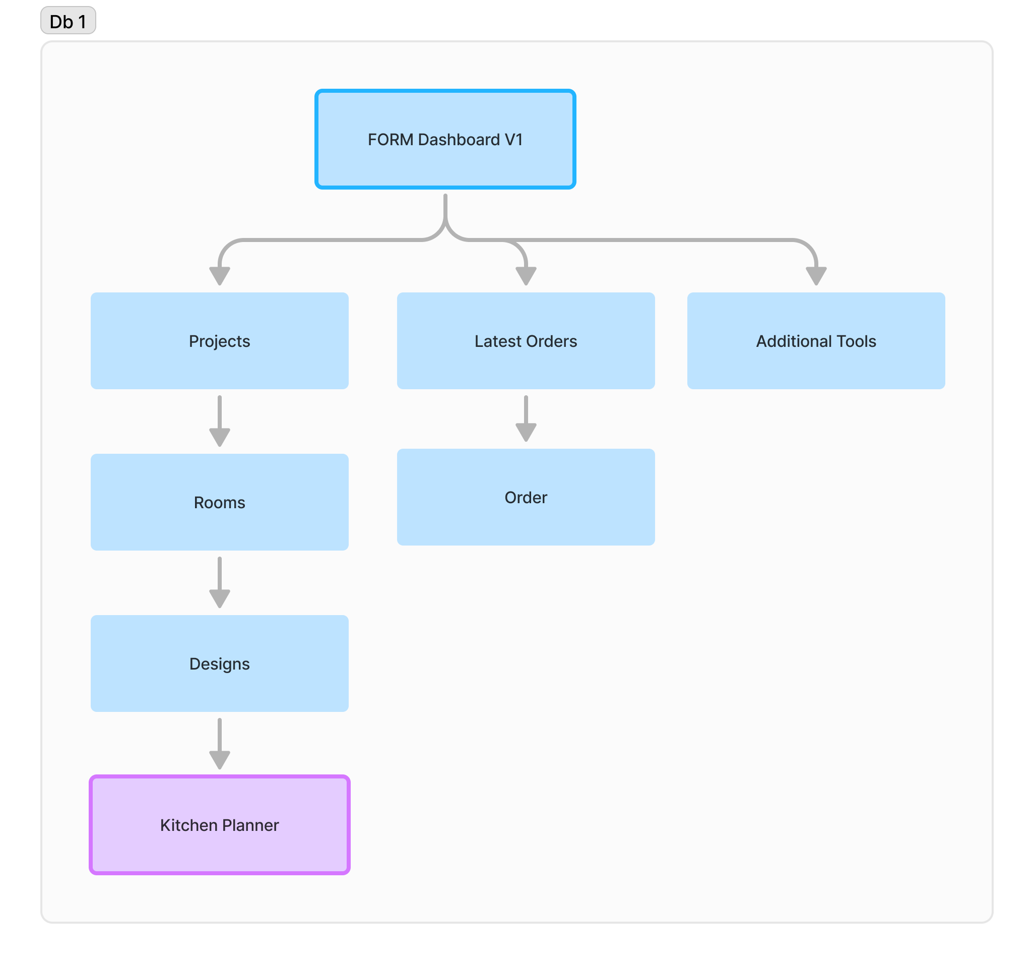
Sitemap
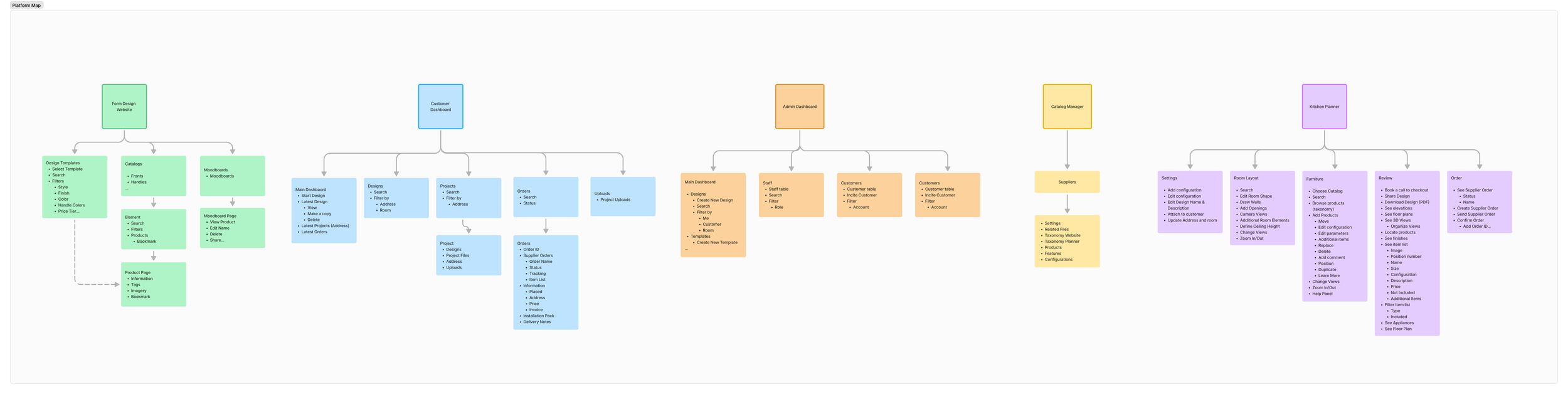
Since our team consisted of 7 people—2 designers (myself included), 4 full-stack developers, and 1 developer focused on the planner—it was crucial to define the key parts of the platform to divide tasks efficiently and ensure we could complete the project within a year.
FORM Design Walkthorugh
Key Features
-
![An image of the Cultural Center.]()
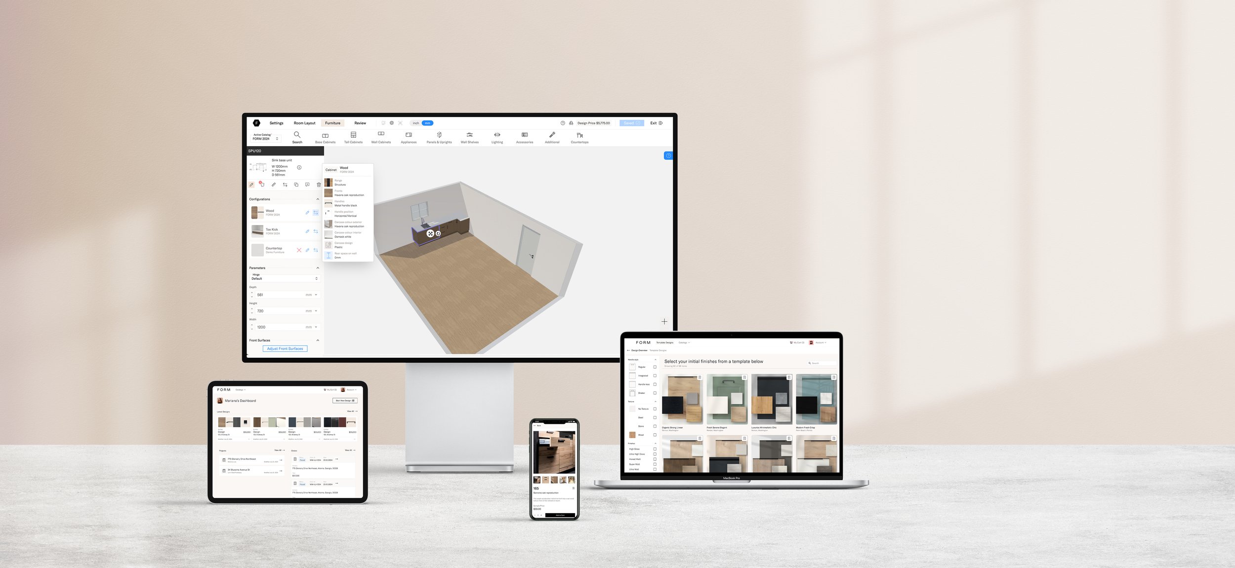
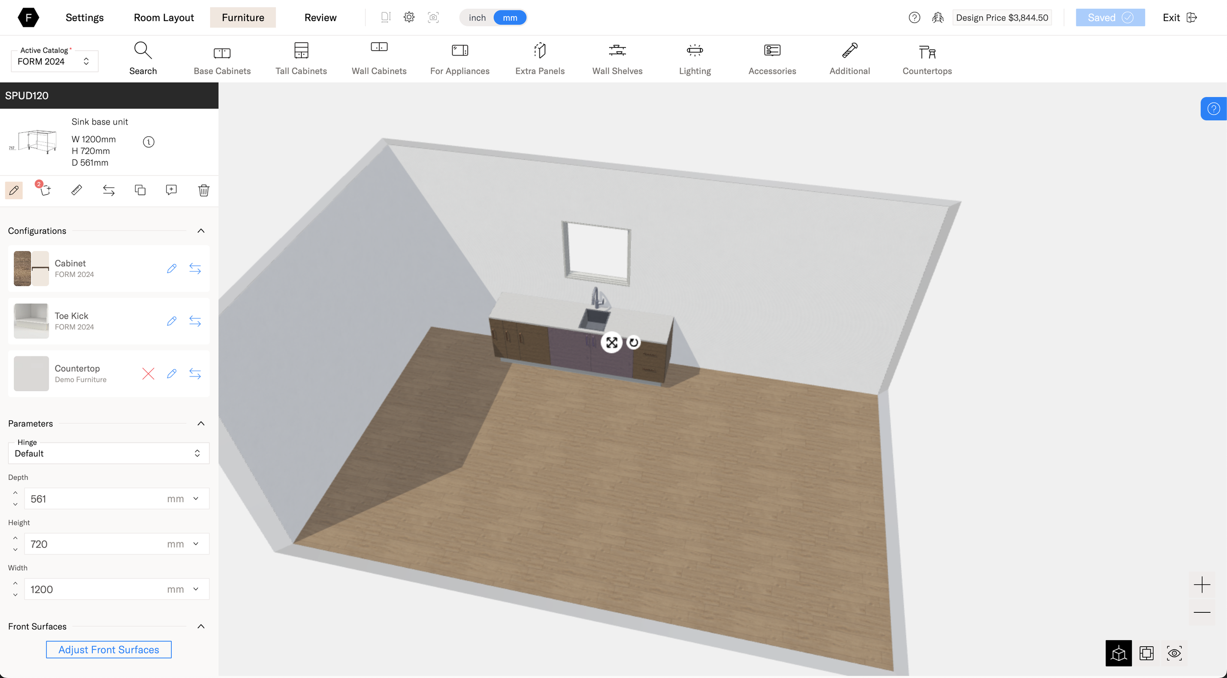
Kitchen Planner
-
![An image of the Cultural Center.]()
Configurations
-
![An image of the Cultural Center.]()
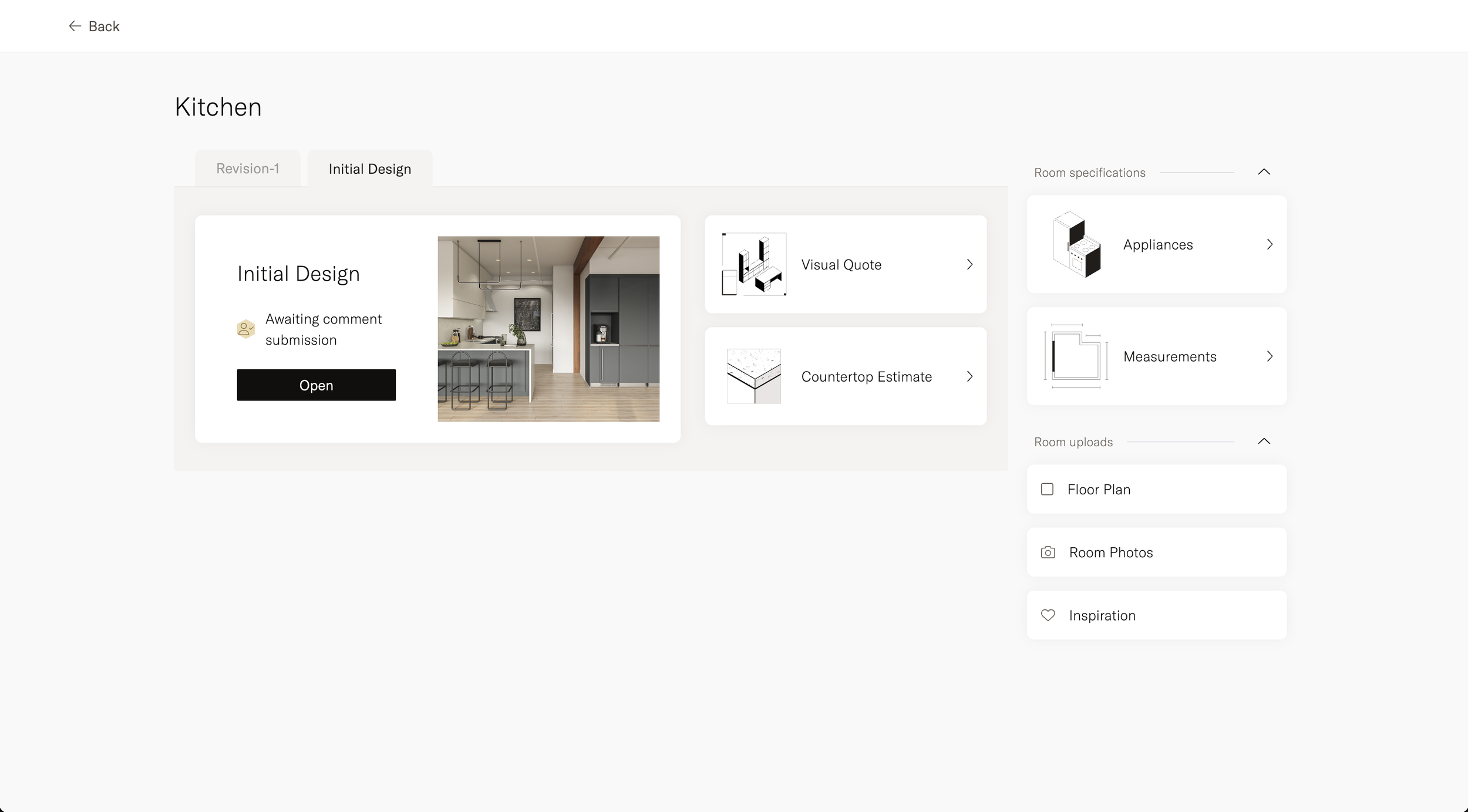
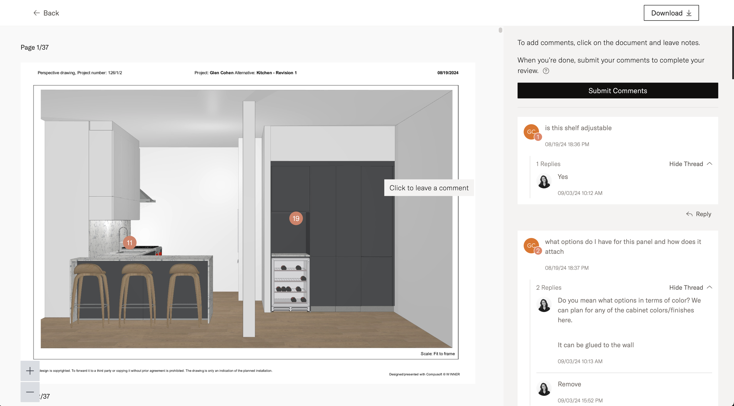
Design Review
-
![]()
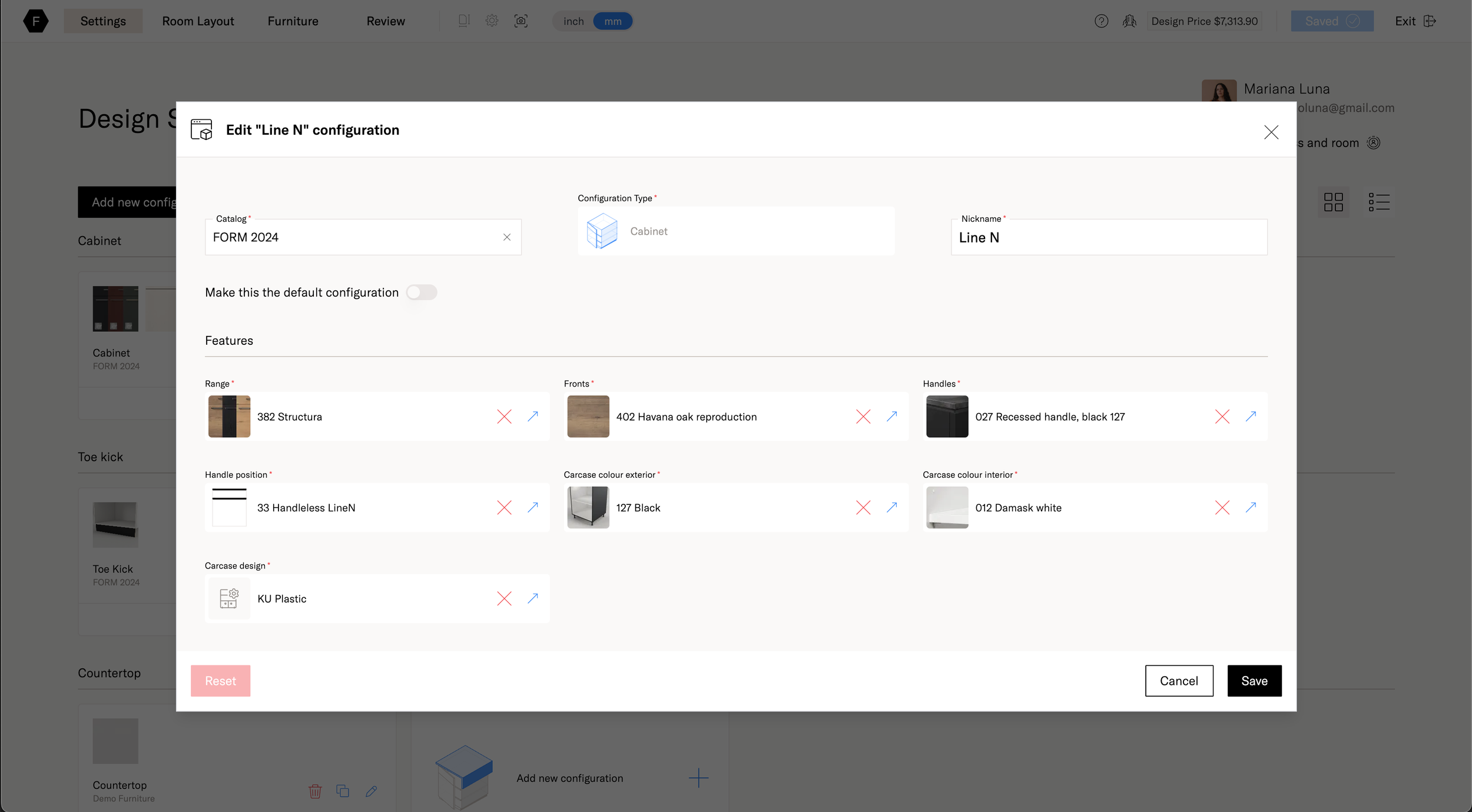
Catalog Manager
-
![]()
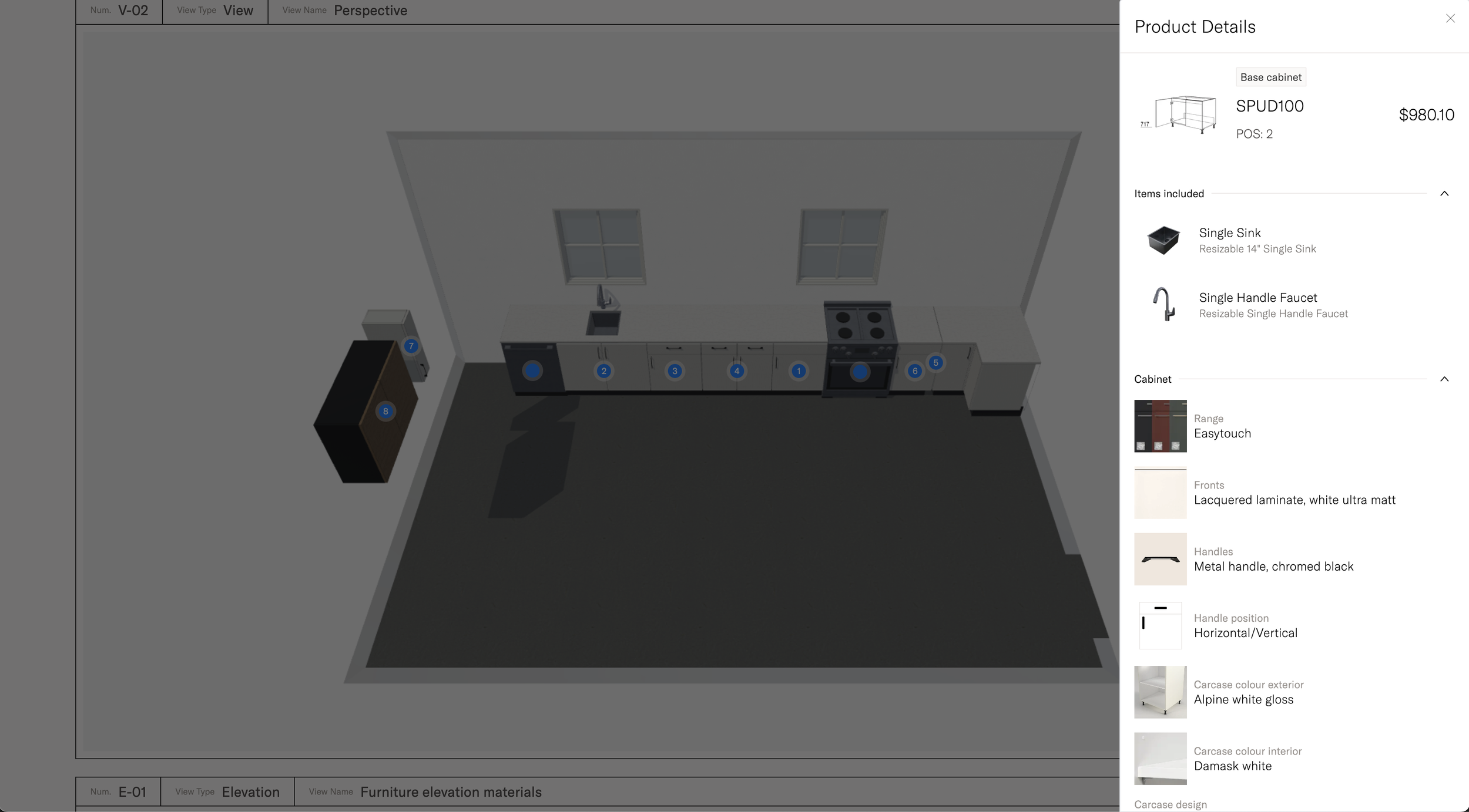
Catalog Product Page
-
![]()
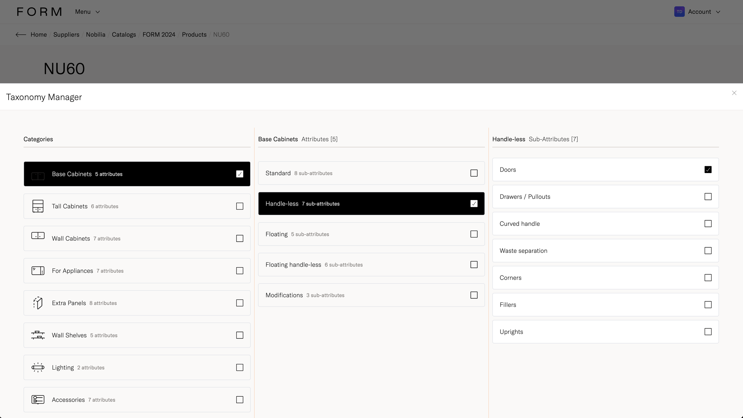
Taxonomy Manager
-
![]()
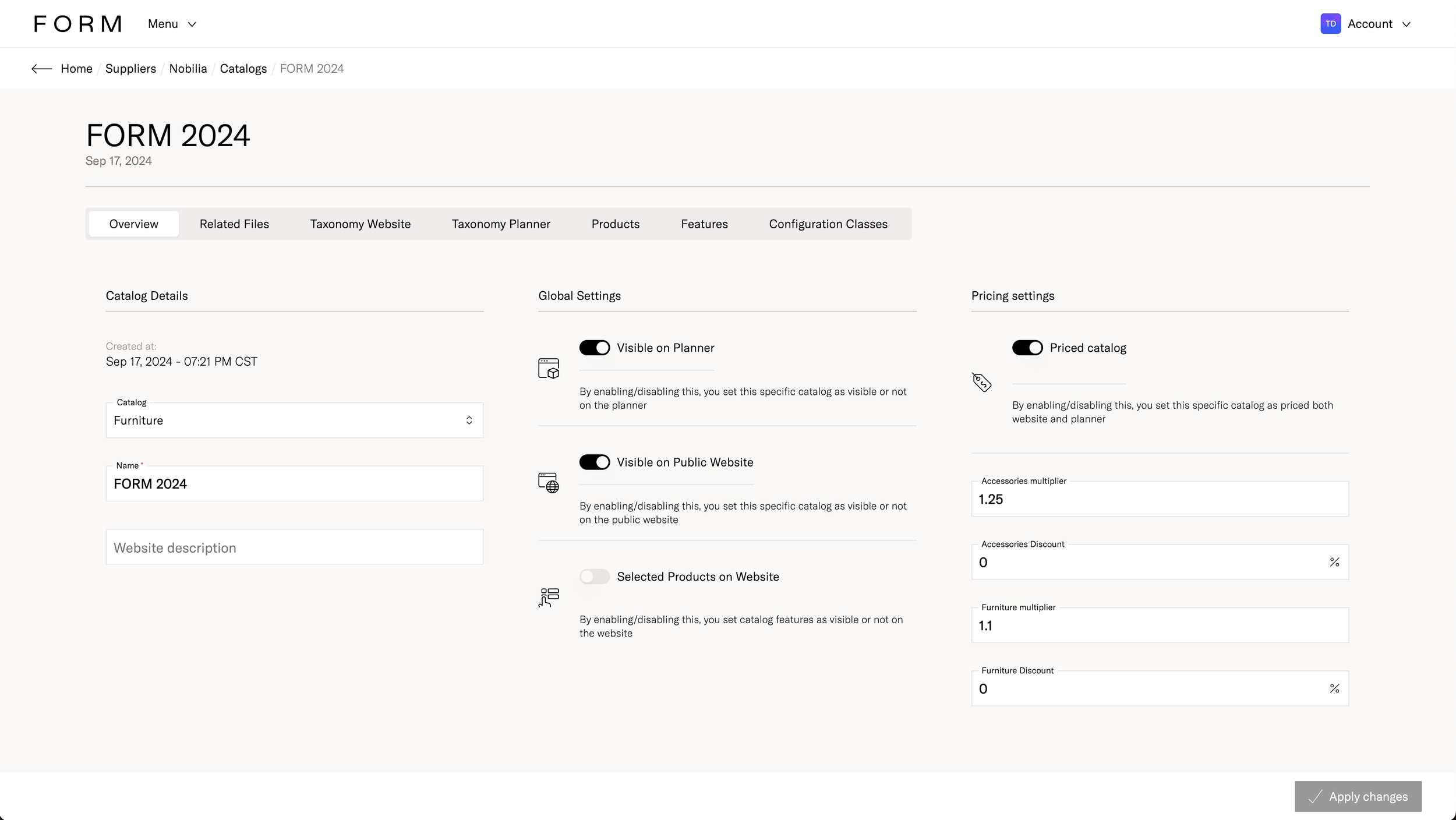
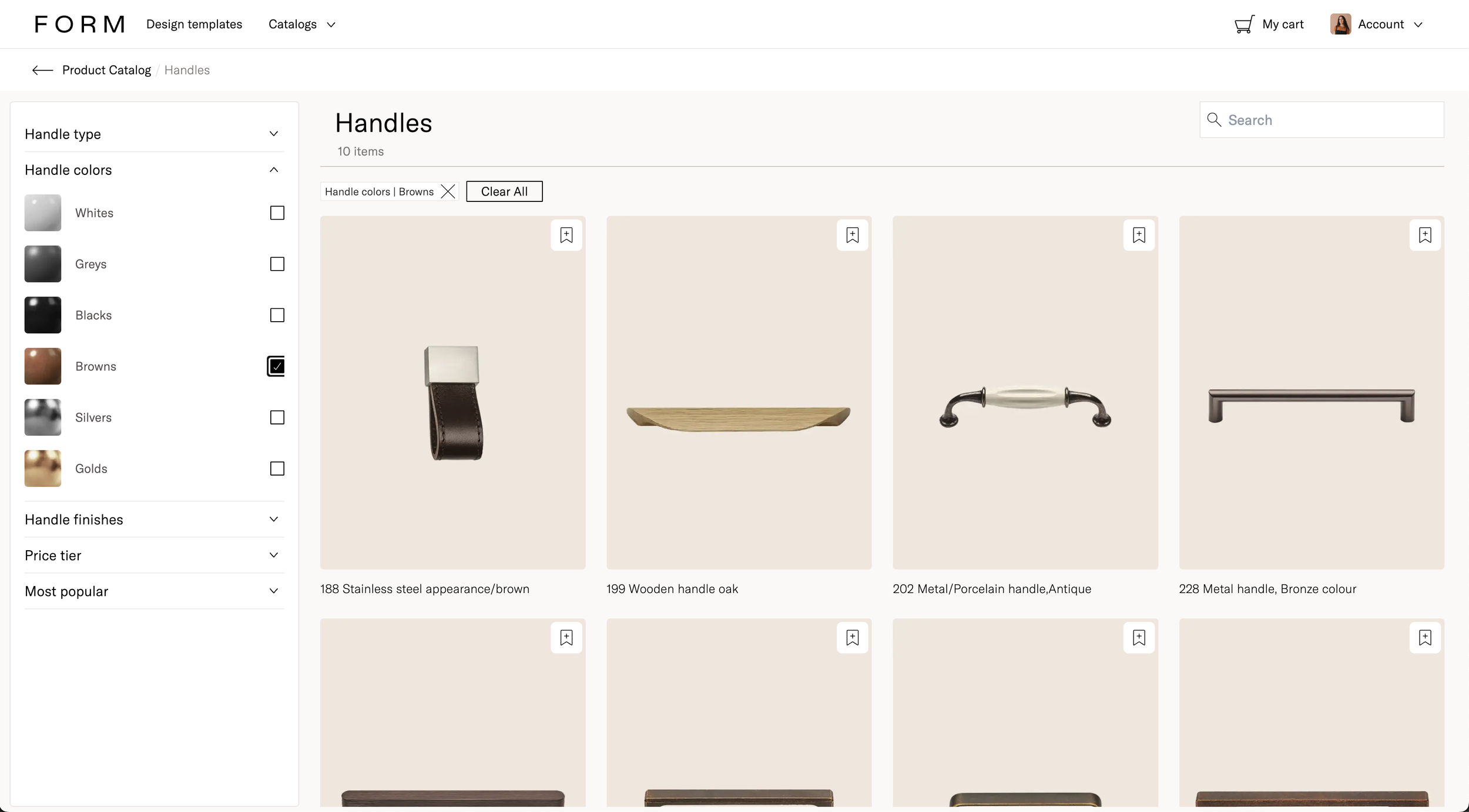
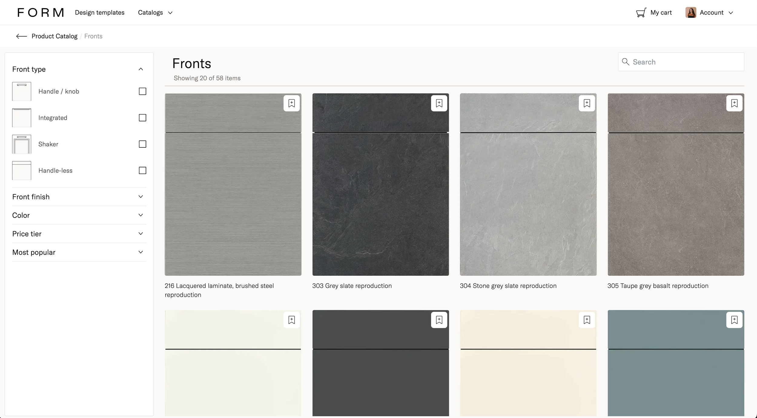
Catalogs
-
![]()
Catalogs
-
![]()
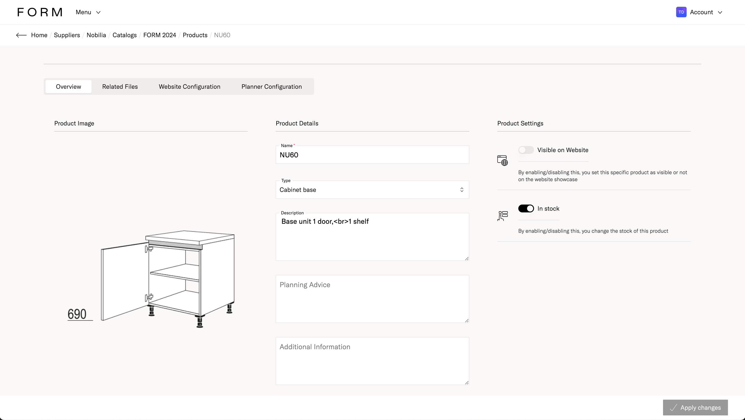
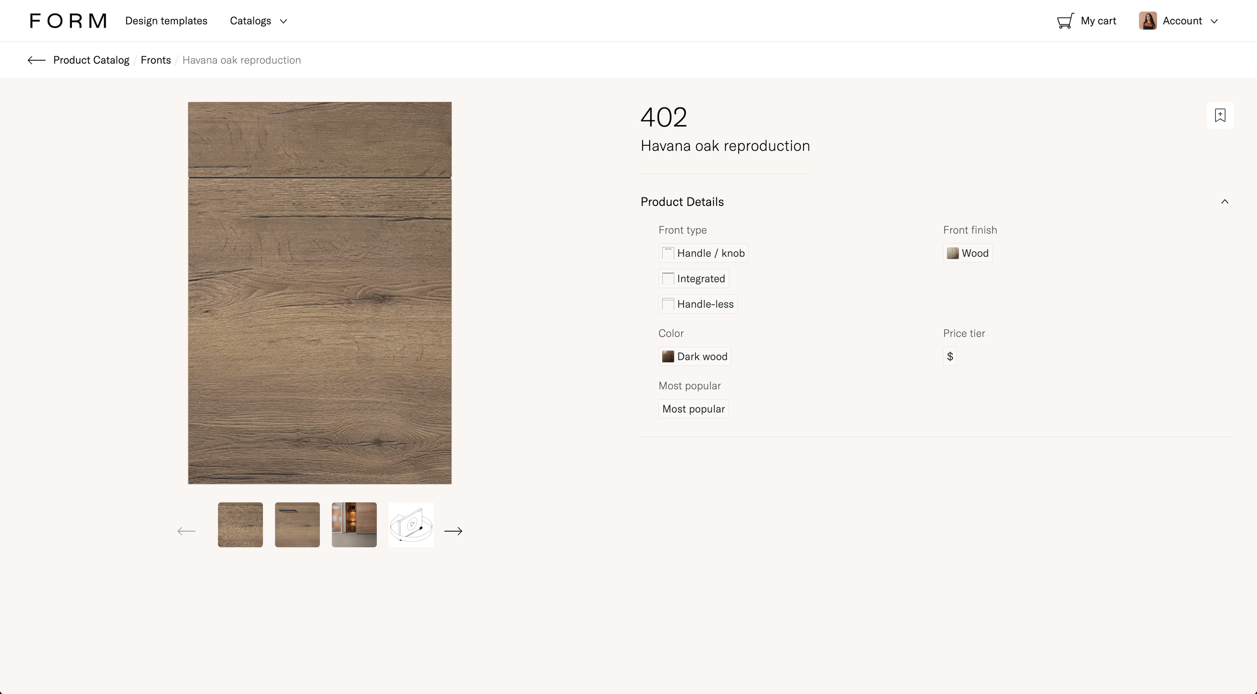
Product Page
-
![]()
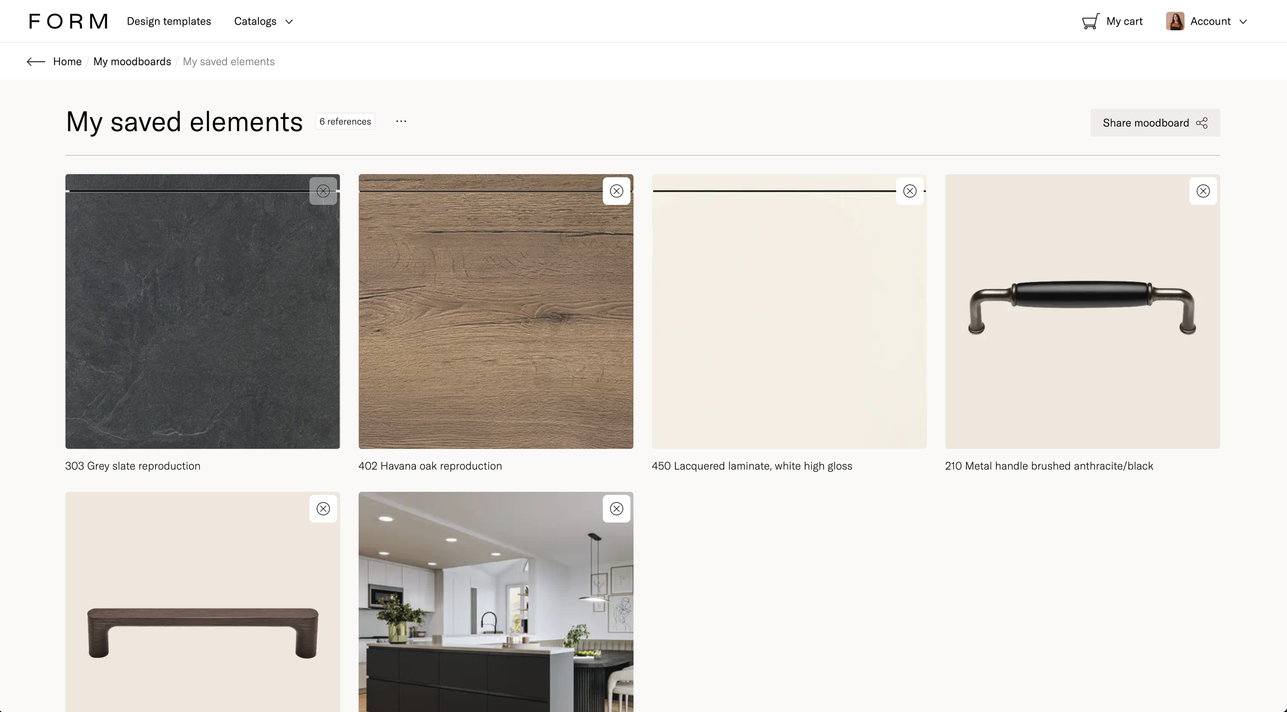
Moodboards
-
![]()
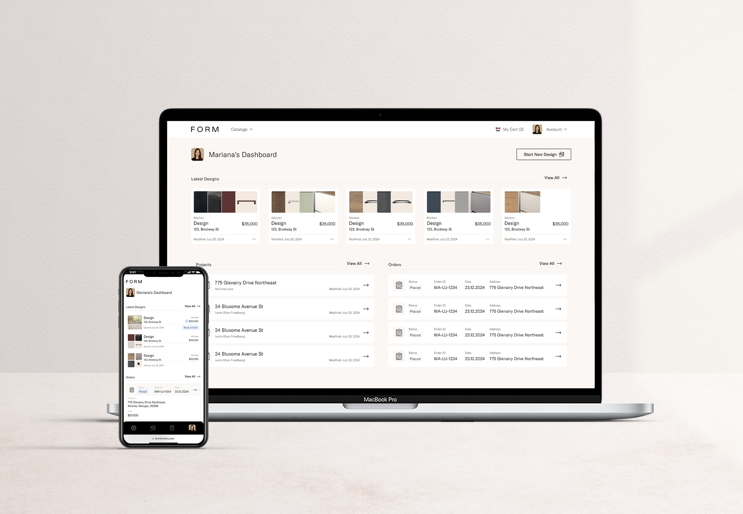
Dashboard
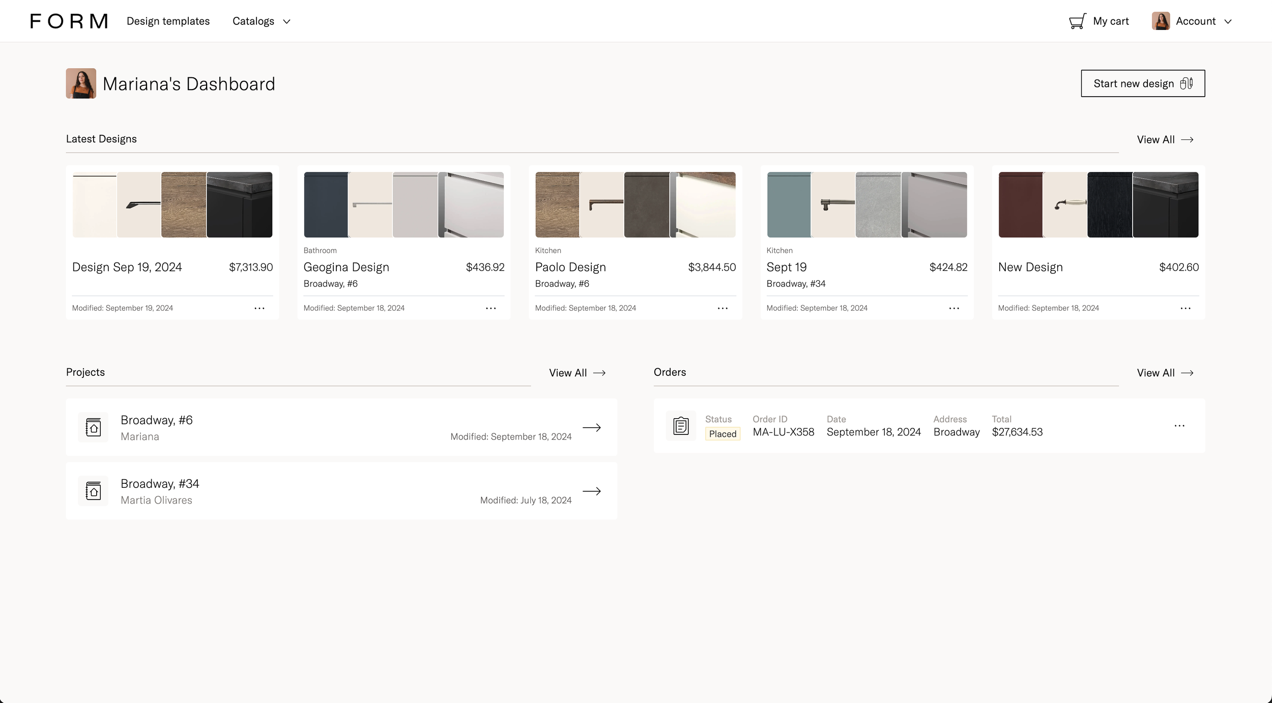
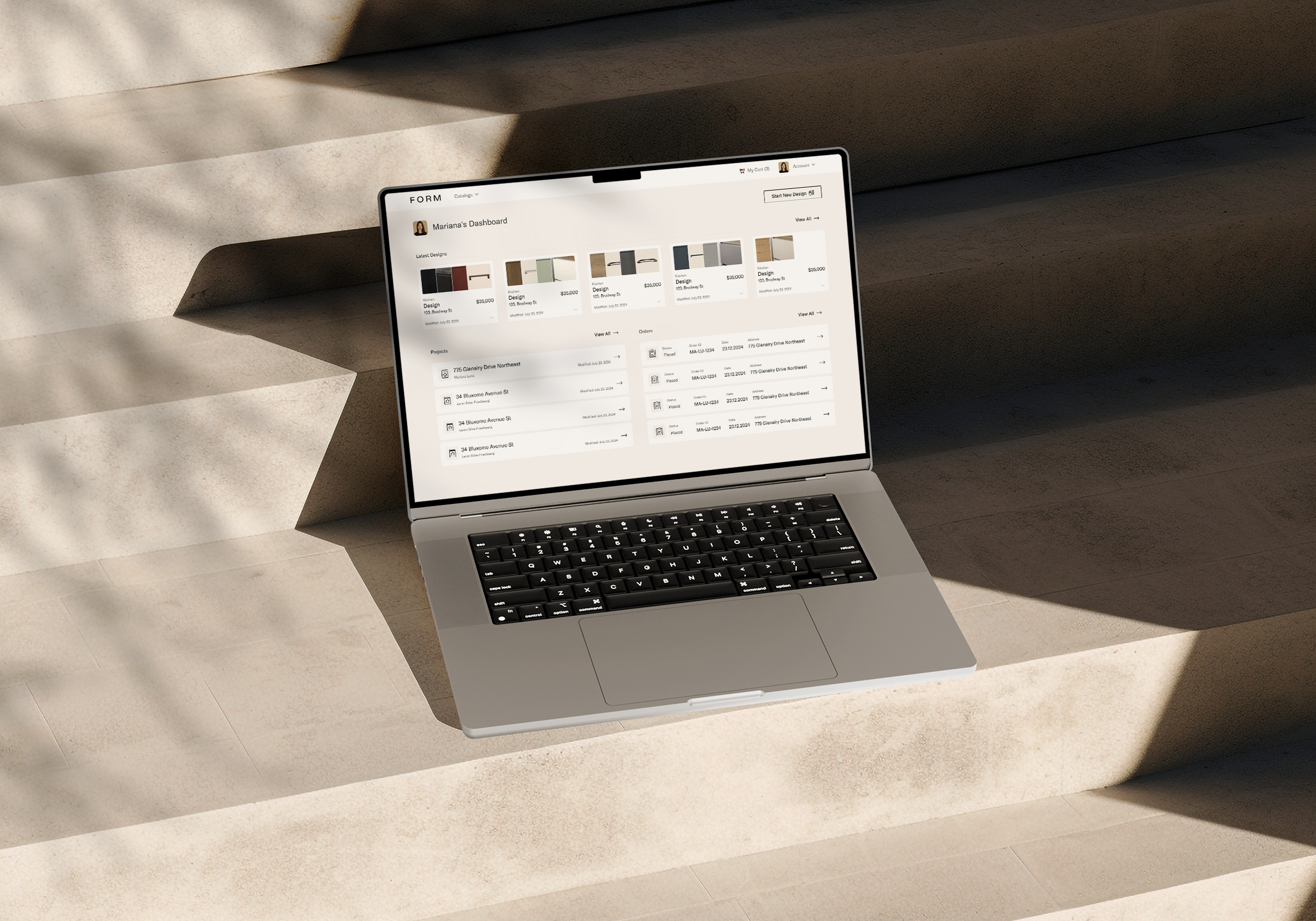
Customer Dashboard
Design approach
I previously designed the FORM Kitchen App, and for FORM Design, we aimed to maintain consistency in things like typography and color palette, while making it more functional.
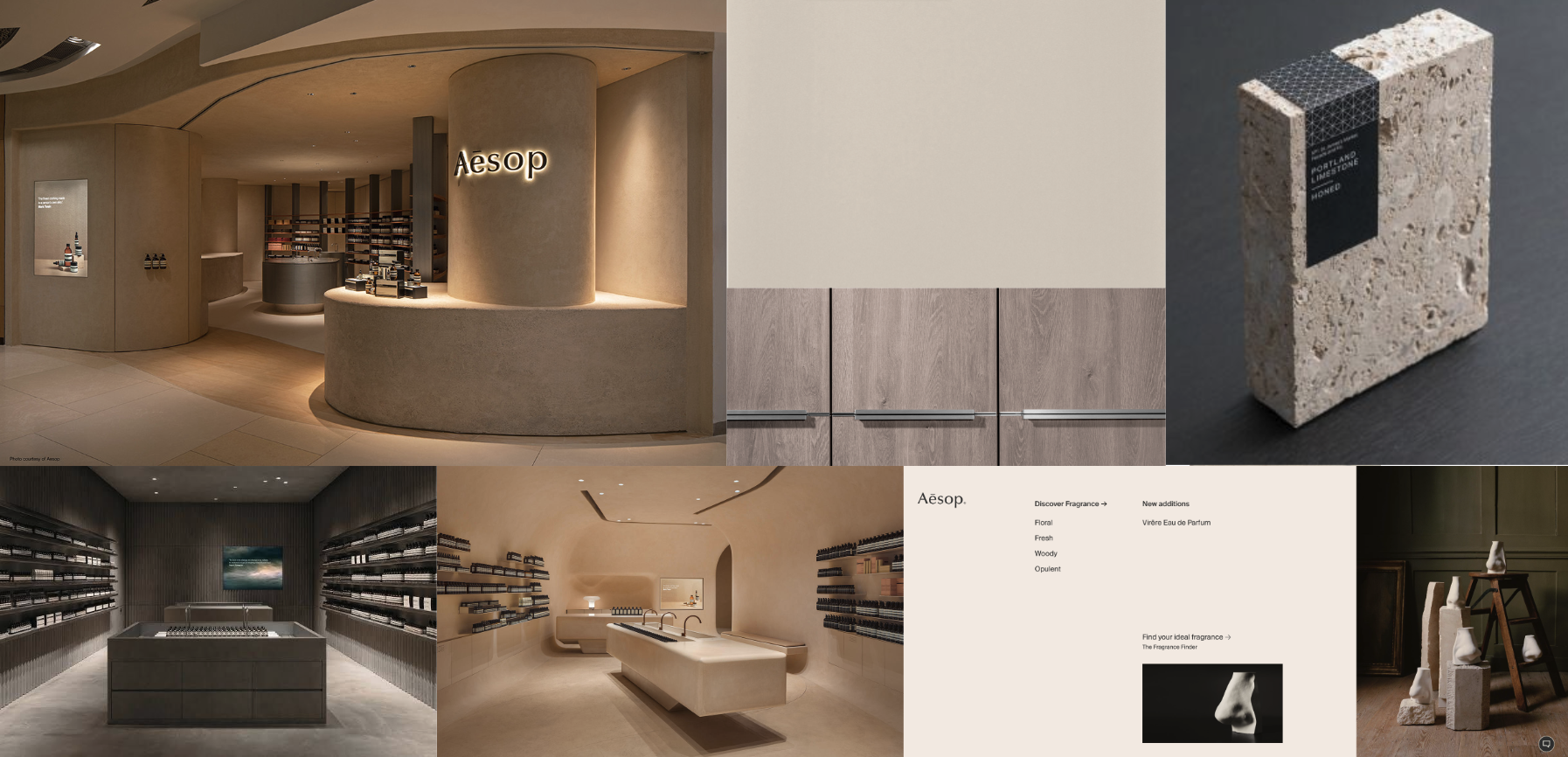
The Branding team shared design references that were being used for the new studios set to open, and I used those as inspiration.
FORM Kitchens
-
![An image of the Cultural Center.]()
Customer Dashboard
-
![An image of the Cultural Center.]()
Design View
-
![An image of the Cultural Center.]()
Design Review
-
![]()
Admin Dashboard
-
![]()
Upload Design
-
![]()
Visual Quote
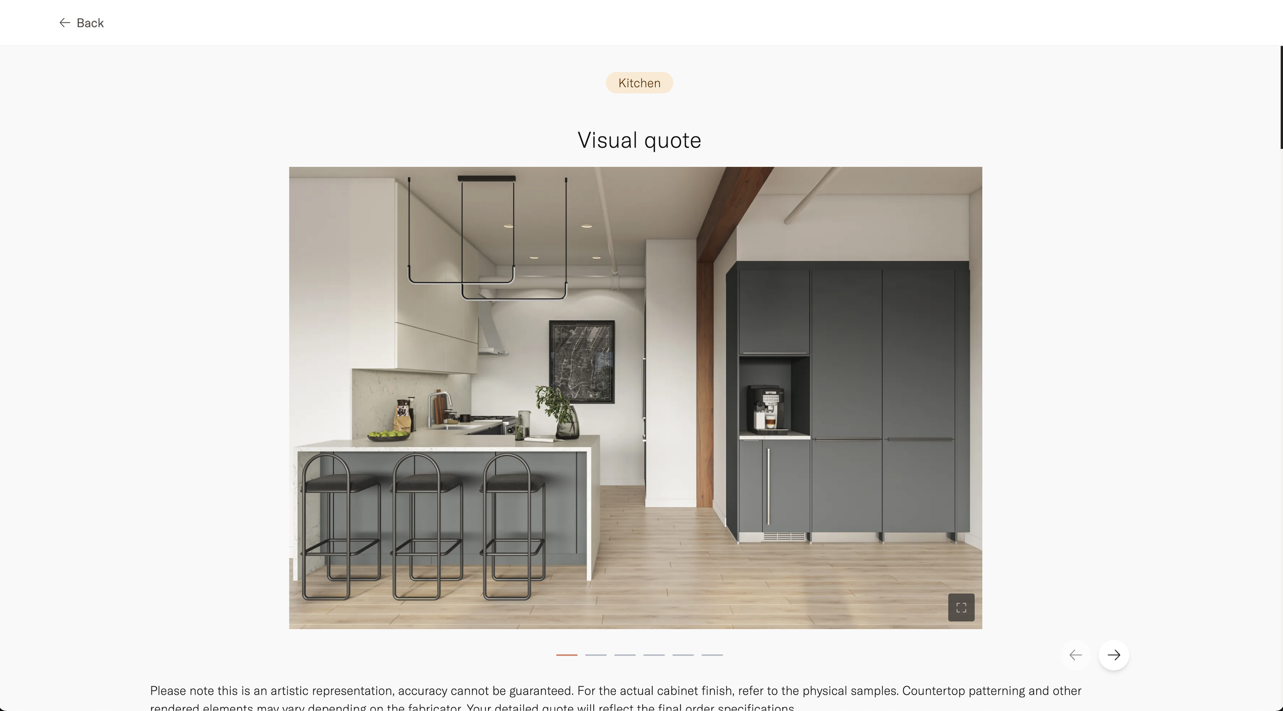
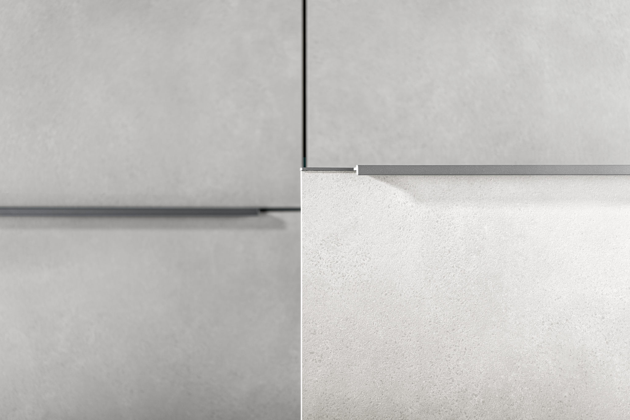
Moodboards and inspiration
Defining the UI design
We chose the shadcn/ui component library, which gave us a head start with pre-built components and functionality. However, I was responsible for defining the overall Design System.
I started by designing a few key pages to establish the essential elements, such as the font system, colors, buttons, cards, and borders. Once those were finalized, I collaborated with the team to develop the rest of the components using that foundation.
This approach allowed developers to start building admin flows with the library, while we simultaneously created our own custom component library.
Although unconventional, this method allowed the design team to skip the traditional wireframing phase (gray boxes and rectangles) and instead work directly with components. These components could be refined over time, ideally using real information rather than just placeholder boxes.
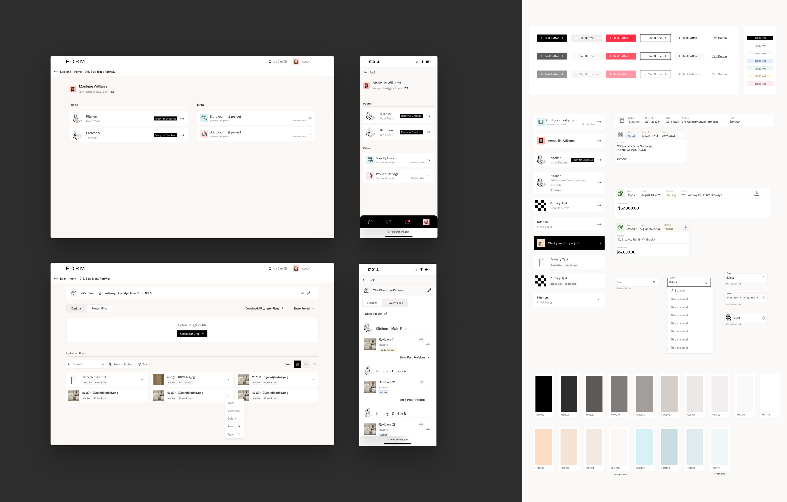
First key pages to jumpstart the creation of the design system and component examples
Defining the UX of the customer dashboard
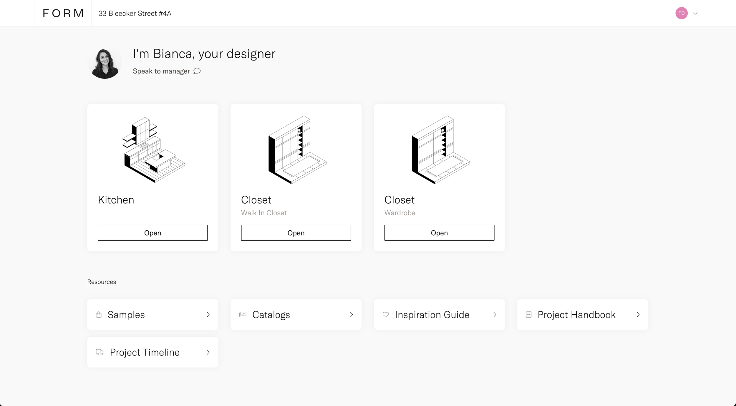
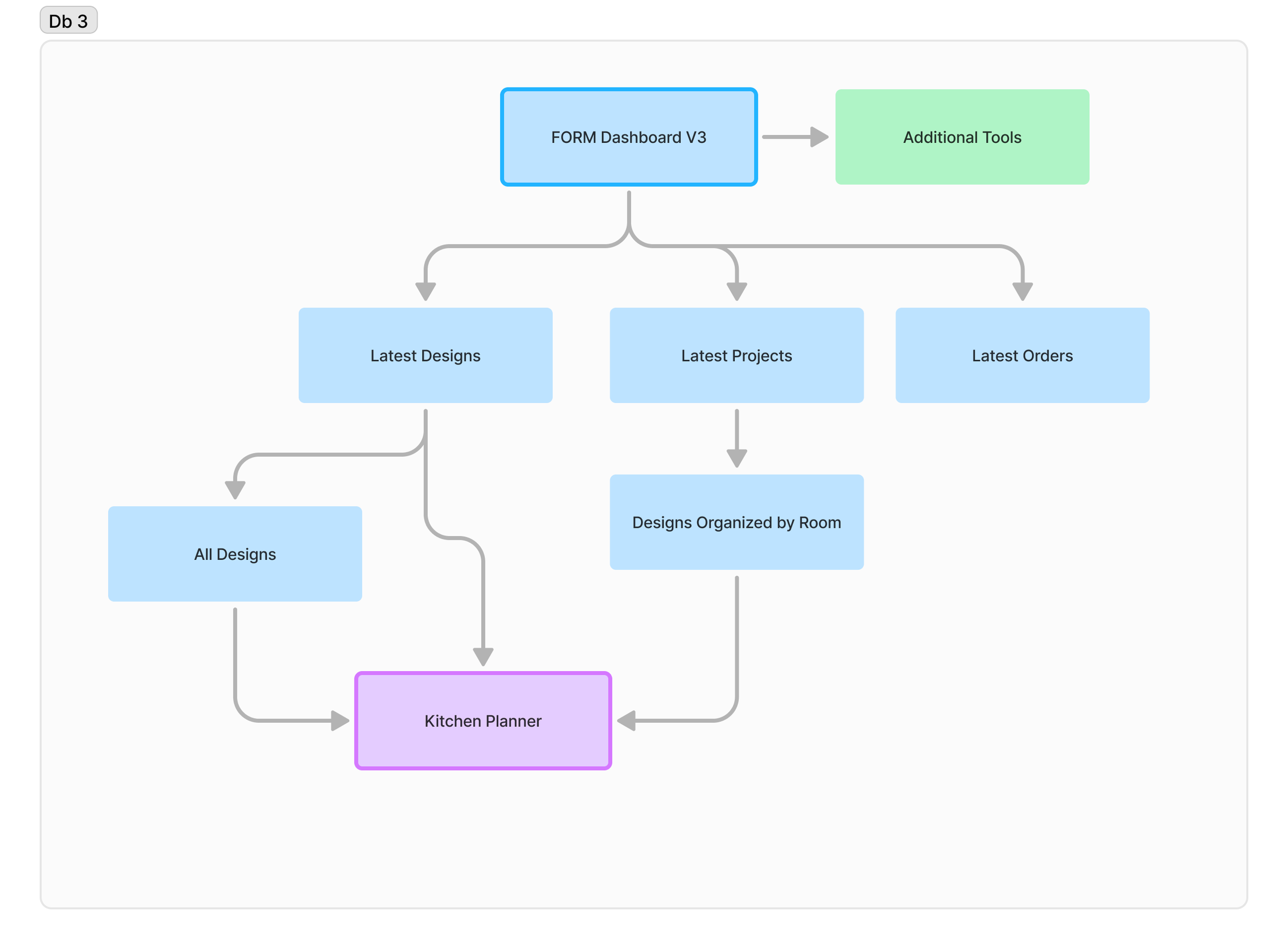
To define the user experience, we based the data model on the dashboards from the FORM Kitchens platform. We believed that maintaining an organized dashboard was essential for designers. So I structured the dashboard by showing the project first, which contained rooms, and each room had its own design—a solution that felt intuitive at the time.
However, my previous experience introduced some bias into this decision.
Data Model: Customers have projects contain rooms, and rooms contain designs.
My focus was on maintaining order, rather than minimizing clicks—a realization I only came to after presenting it to another designer.
This created an ordered dashboard but the experience wasn’t ideal since it took the designers 3 clicks to get to their design.
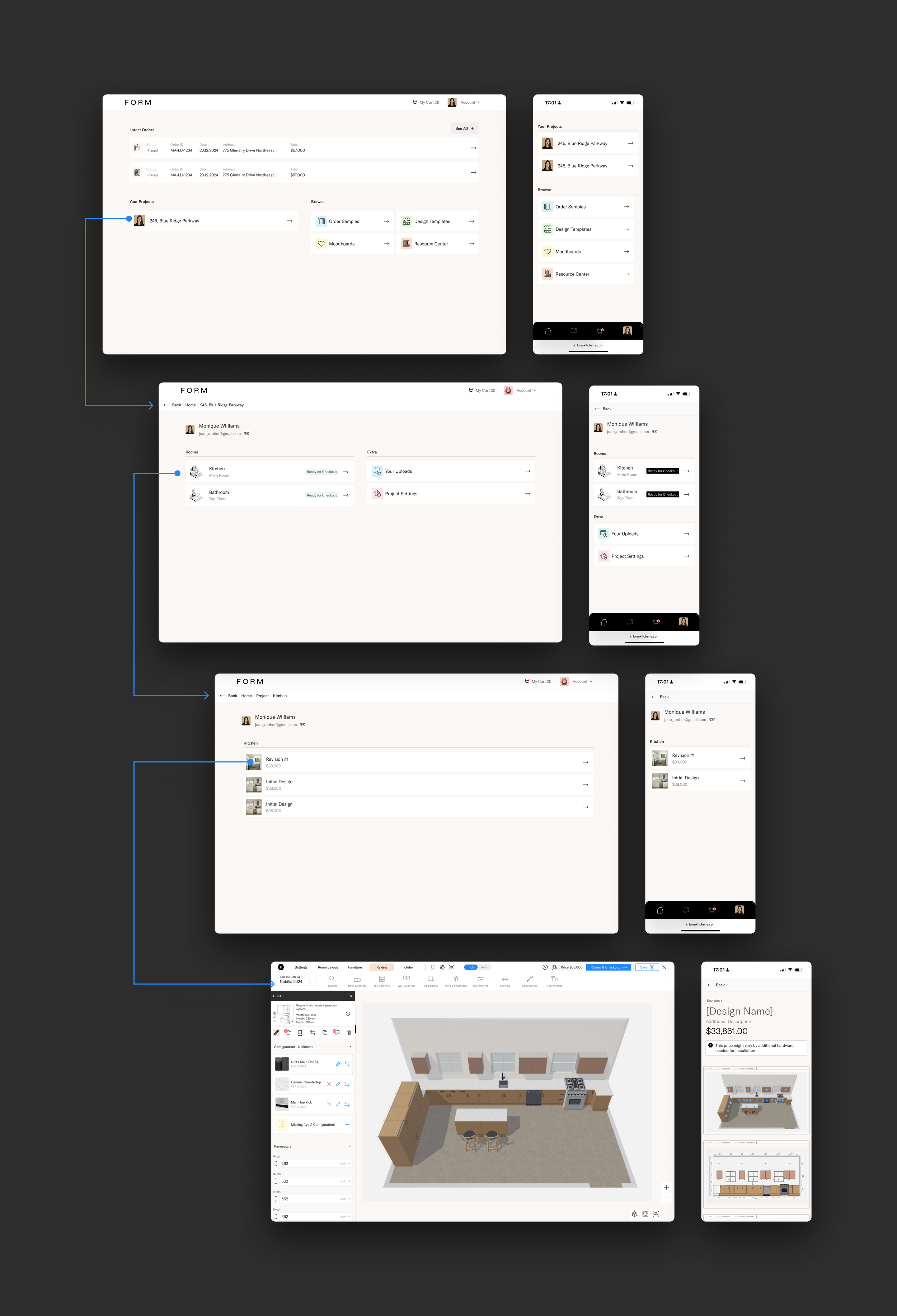
The main dashboard was full of complexity and no designs to be seen.
Designers Feedback
“It’s difficult to get to my design, I never remember in which project I was working on. ”
Designers Feedback
“Some clients don’t even give me their address until they are ready to order.”
Designers Feedback
“I whish I could just see my designs, but I don’t get what the other stuff is.”
Improving the experience
With that feedback, I realized I was focused on creating an ordered model to keep the data consistent, but I had overlooked the main point:
This is, above all, a tool for designers to create, review, and order their designs.
The key decision was to make Designs the central object. We could then attach an address to it to form a project and tag which room it belongs to. This required changing the data model so that designs could exist independently from projects and rooms, yet still be created seamlessly. If users wanted to edit properties like the address or room, they could—but it wouldn’t be mandatory.
Final Data Model: Customers have designs. These designs can belong to a project. The designs can be classified by room (tag).
Although this was a significant shift, it simplified everything. I had to negotiate with the engineering team about implementing this change, and while no one enjoys reworking, I convinced them of its benefits.
As a result, we were able to display the most recent designs on the main dashboard, giving users quick access to their latest updates, orders, and projects.
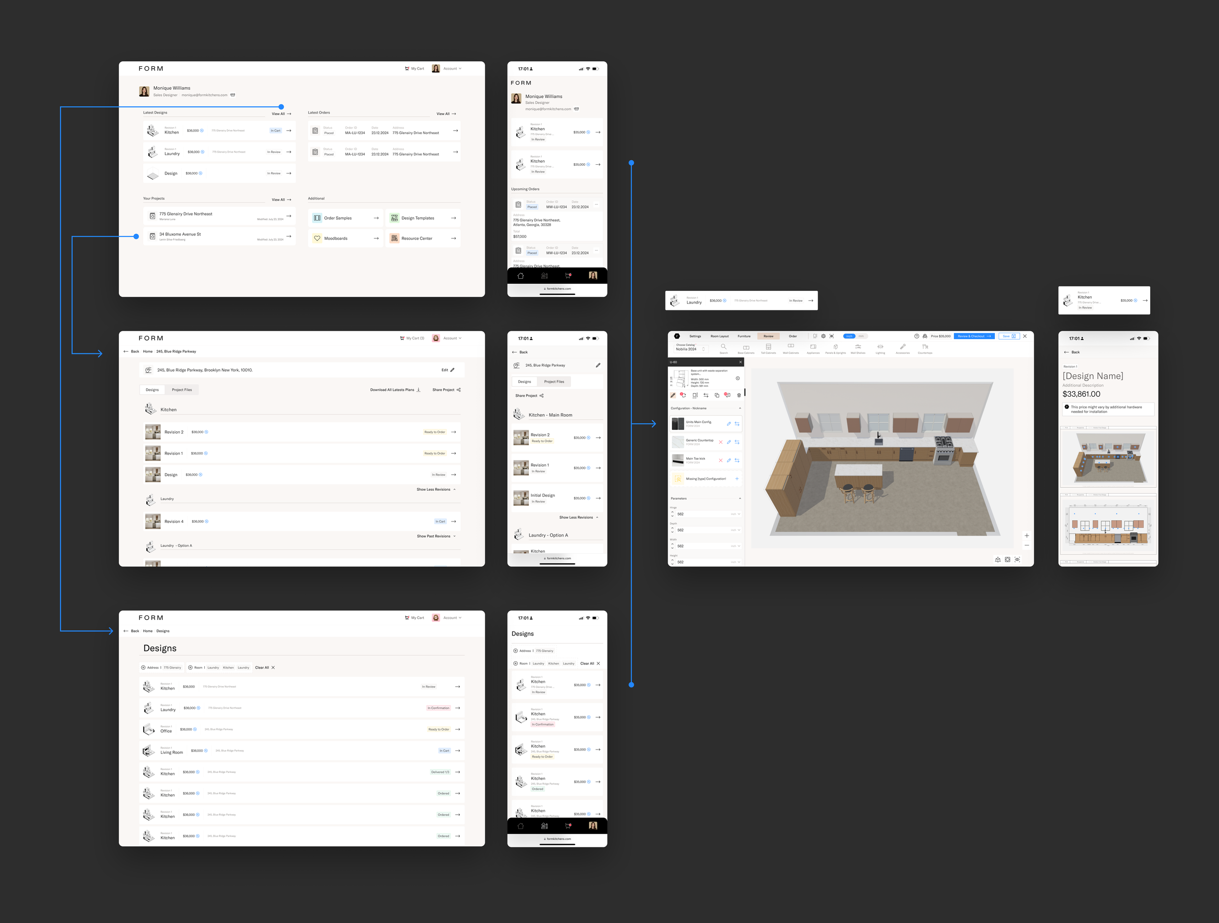
Removing the complexity allowed for the user to reach the design faster
Designers Feedback
“I cannot differentiate which design is which, everything has the same name, there’s still too much going on.”
Designers Feedback
“Most of my designs will stay as un-categorized, no room or address.”
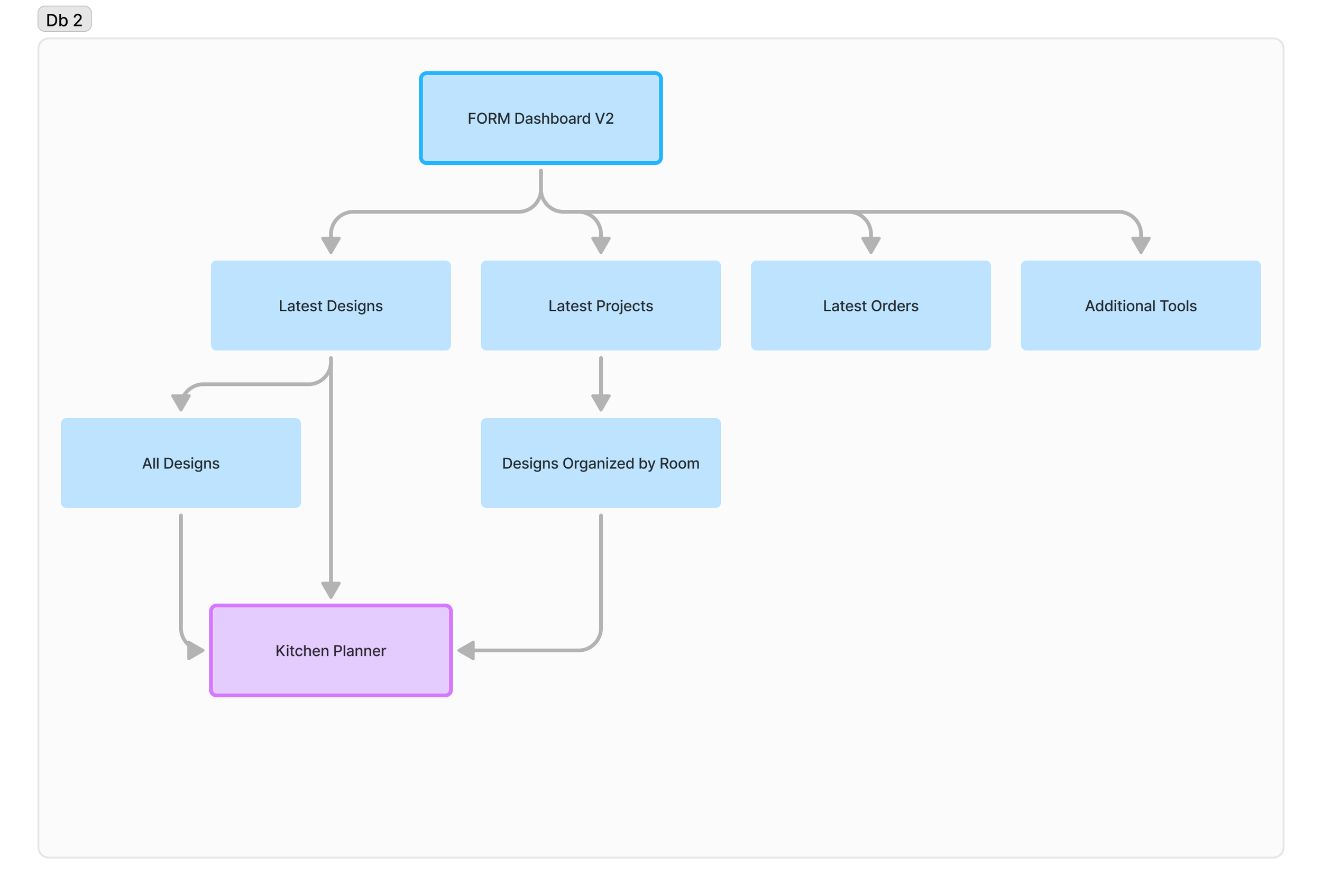
Make it simpler
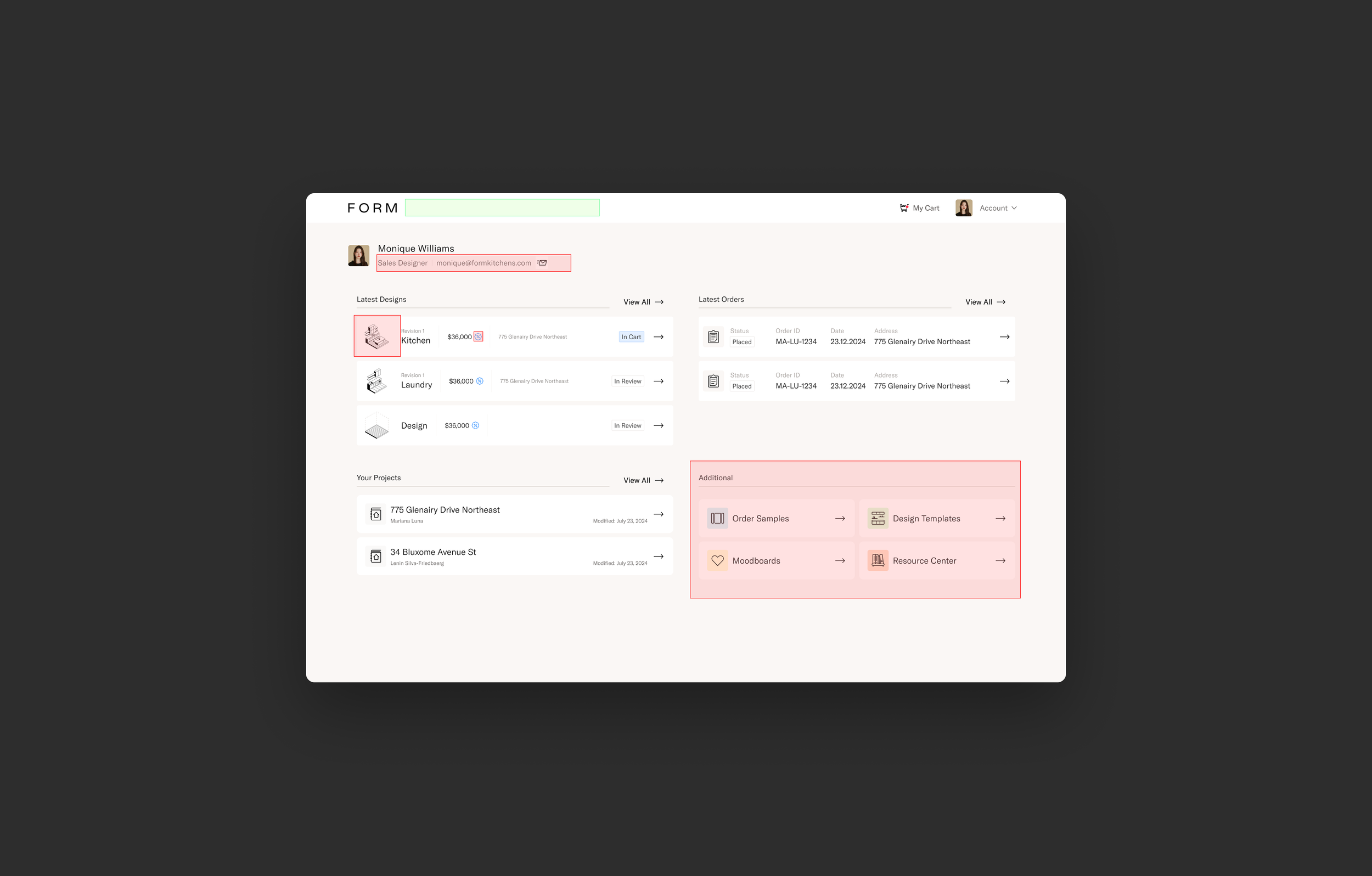
I wanted to remove even more clutter from the dashboard.
Designers should see only the 3 main objects:
Designs (5)
Orders (5)
Projects (5)
I’d need to find somewhere to keep all the additional resources at hand but without causing distractions.
I decided to remove anything not essential to design, keeping the main dashboard as clean as possible.
Identifying opportunities
Make it visual
I needed to find a way for designers to quickly identify their designs without relying on the name, address, or room—something more visual.
The key was to ensure this solution would be consistent across all project types and ideally aesthetically pleasing.
Challenges:
Not all designs have aesthetic 3D views or elevations
Some designs might not be finished or have any cabinets to show
Keep it dynamic, do not hardcode.
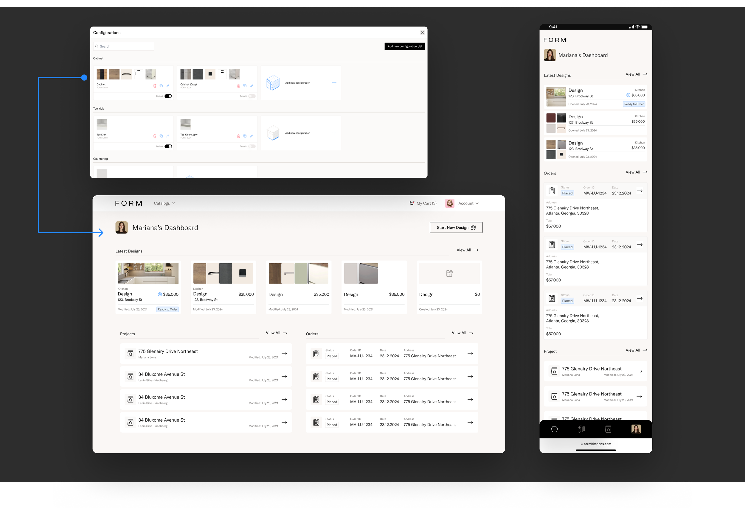
I realized we could use the main finishes from each configuration in the design to serve as a visual identifier.
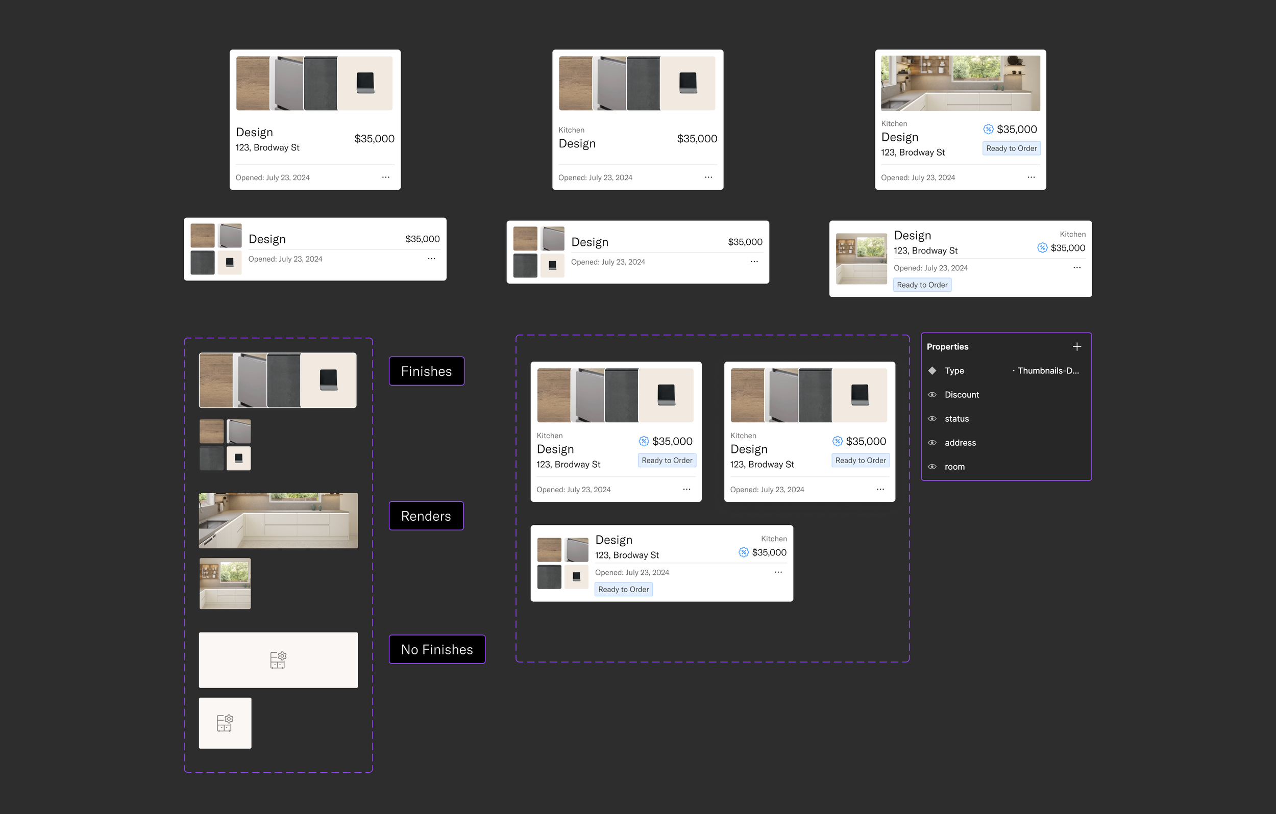
Creating the component taking on account all variables
Final Exploration
Due to the customer flow, I decided to separate the designs done by the customer’s and the ones reviewed by the Technical Designers, in order for the users to find and buy them quickly.
Once the design and its variants were defined, I synced with the engineering team to ensure everything was clear.
They were already working on the data model changes, and since I was sourcing all the data from the design in the planner, their main task was to create the new component and make a few layout adjustments in the dashboard.
This streamlined the development process, allowing the project to progress smoothly
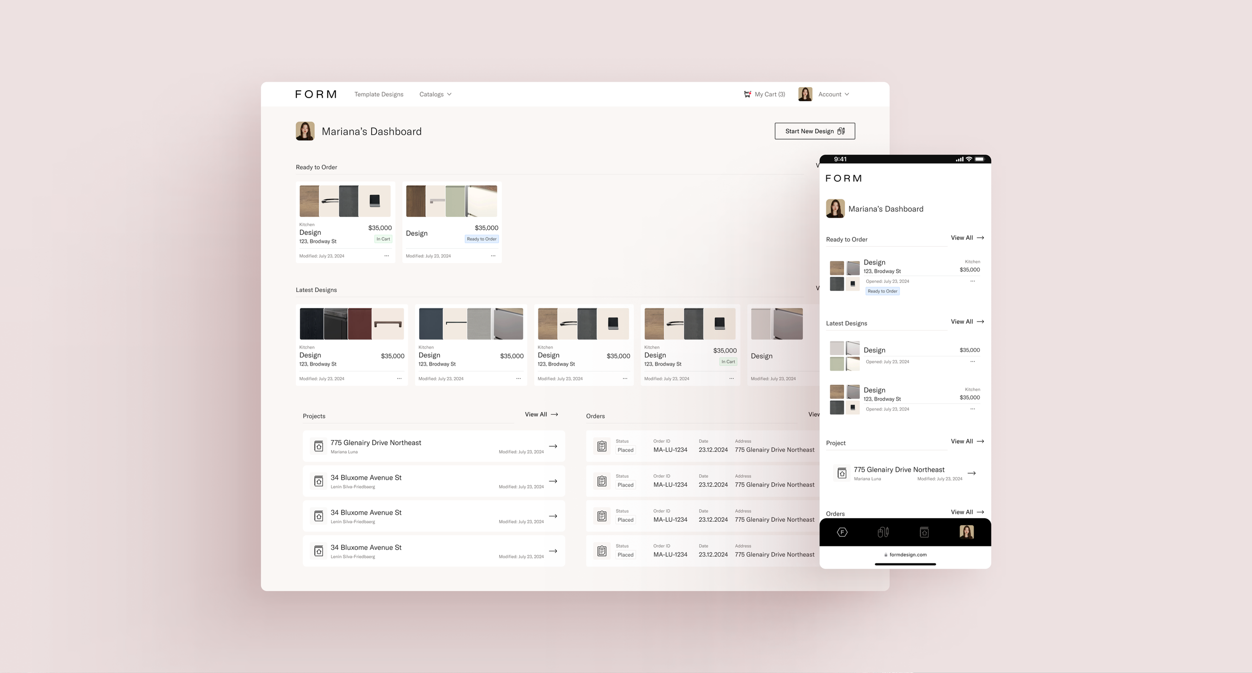
Dashboard Walkthrough
Key Learnings
Approach projects without previous biases. What I believe to be true may simply be something I’m holding on to unnecessarily.
If it improves the customer experience, it's worth reworking. Even if it's frustrating, the results will outweigh the struggle.
Removing clutter creates space for clarity. Trying to show users everything at once often leads to confusion. I need to trust users more and simplify their experience.
Always design with data and image sources in mind. The fewer hardcoded elements, the better for scalability and flexibility.
Even if there’s no user testing available, take the time to ask team members from other areas for their feedback on a design.
Thank you!